Something quiet is happening in American kitchens right now, and it’s showing up on the walls first. These kitchen wall tile ideas aren’t the ones your neighbor already picked. The first one alone might make you rethink your whole stovetop wall.
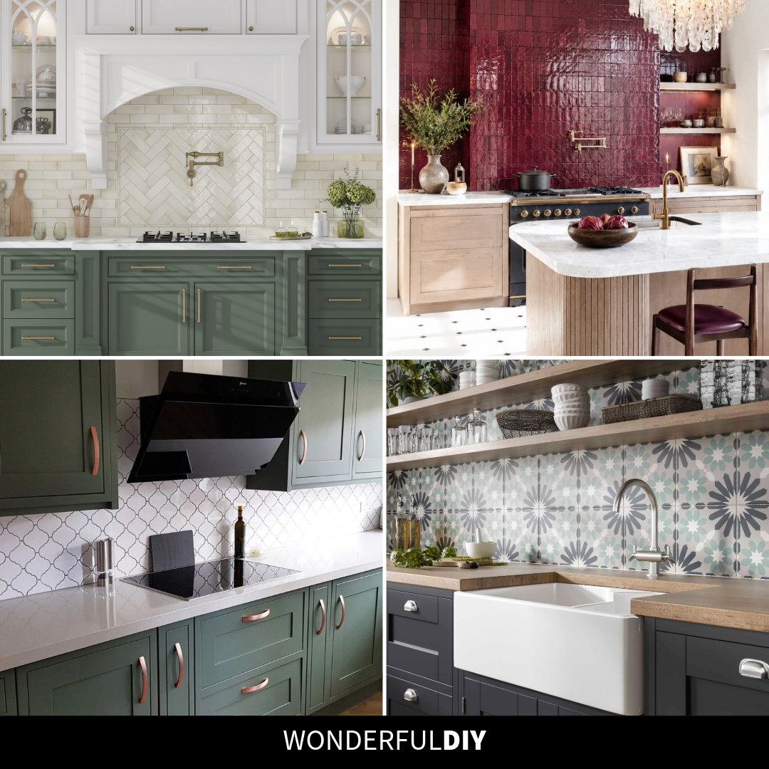
Kitchen Wall Tile Ideas Pulling Rooms Together Right Now
The backsplash is the one part of a kitchen you look at every single day. It’s also the part most people play too safe with, which is why so many kitchens end up feeling fine but forgettable. These seven kitchen wall tile ideas go a different direction.
Some lean soft and classic. A few are bold enough to carry the whole room on their own. Each one earned its spot because it does something a plain white rectangle can’t.
One Small Switch Makes a Backsplash Feel Custom
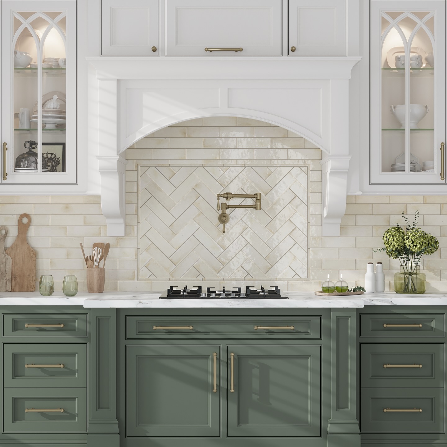
Most backsplashes stop at one direction. This one runs cream subway tile across the wall, then switches to herringbone inside the arched hood frame, and that one change does the whole job. The pot filler sits dead center, the brass hardware ties into the warm tile, and the sage cabinets stop fighting the eye for attention. It’s the kind of move that reads as architectural, not decorative.
When One Wall Does the Whole Job
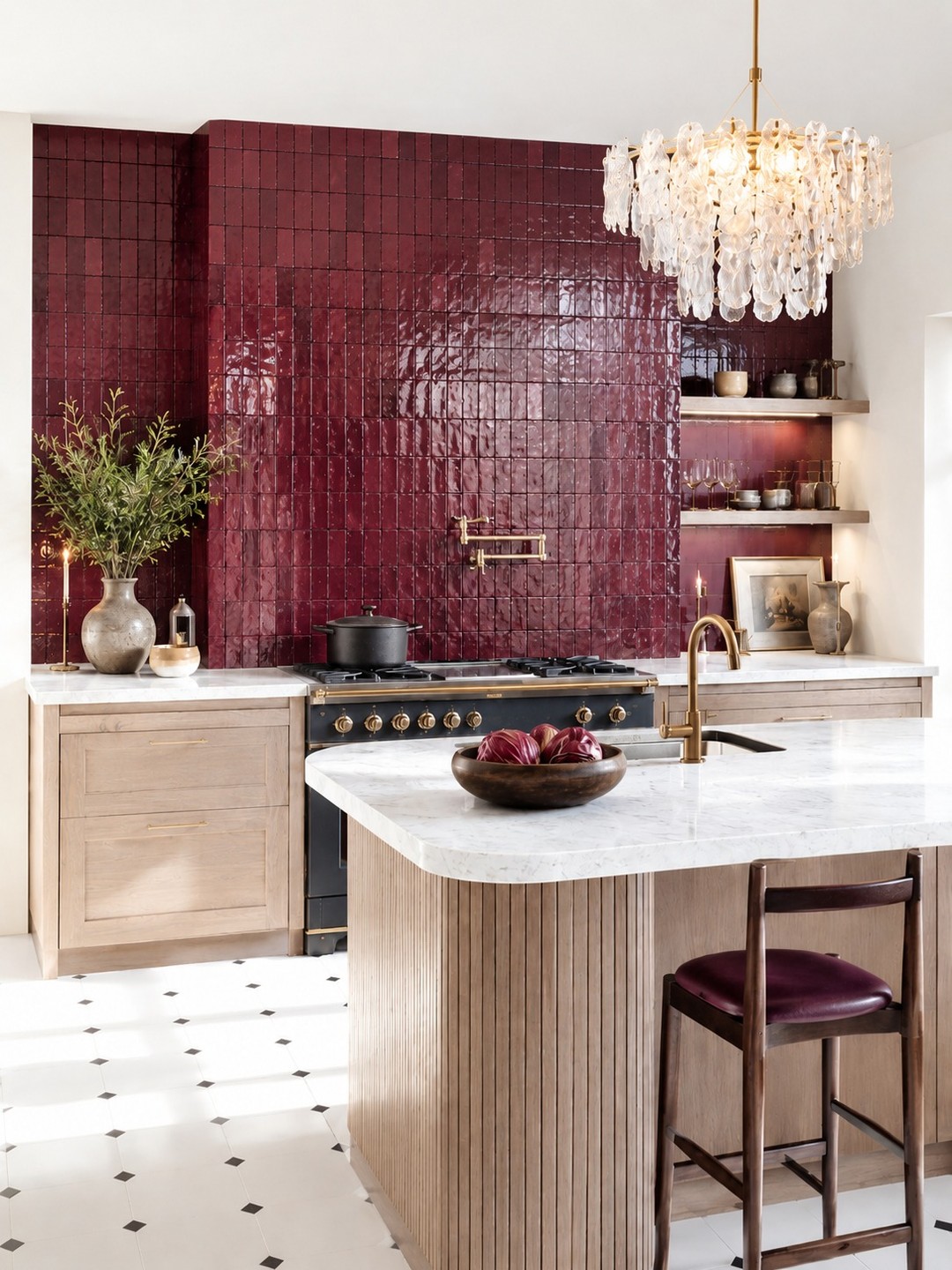
Burgundy zellige, those handmade clay tiles with the puddled, uneven glaze, pulls the entire kitchen into one deep, saturated moment. Taking it floor to ceiling instead of stopping at the hood is what sets it apart. The light wood cabinets and brass fittings feel calmer around it, not louder. If you want a kitchen that actually looks like something, this is how it’s done without adding a single other color.
A Lantern Shape That Reads Classic Without Trying
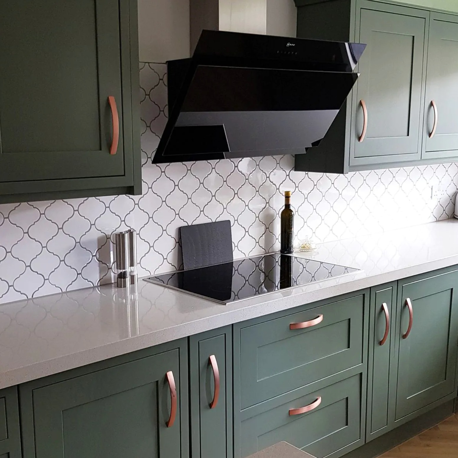
Arabesque, the lantern-shaped tile with the curved sides, is what you pick when subway feels tired but you still want something at home with shaker cabinets. The gray grout here does half the work: it outlines every tile instead of letting them blur together, which makes the pattern feel intentional. Pair it with sage green cabinets and copper hardware the way this one did, and the whole wall quietly becomes a feature.
Where to Add Personality When Everything Else Plays Safe
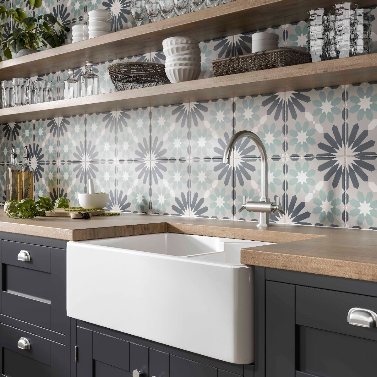
Navy cabinets, wood counters, a white farmhouse sink. All beautiful, all expected. The patterned cement tile is what keeps the whole thing from feeling like a catalog page. The blue and gray star motif repeats across the wall, which gives your eye something to follow instead of a flat surface to glance past. If your cabinets and counters are already decided, this is where you add the personality.
Why Vertical Stacking Beats a Standard Subway Run
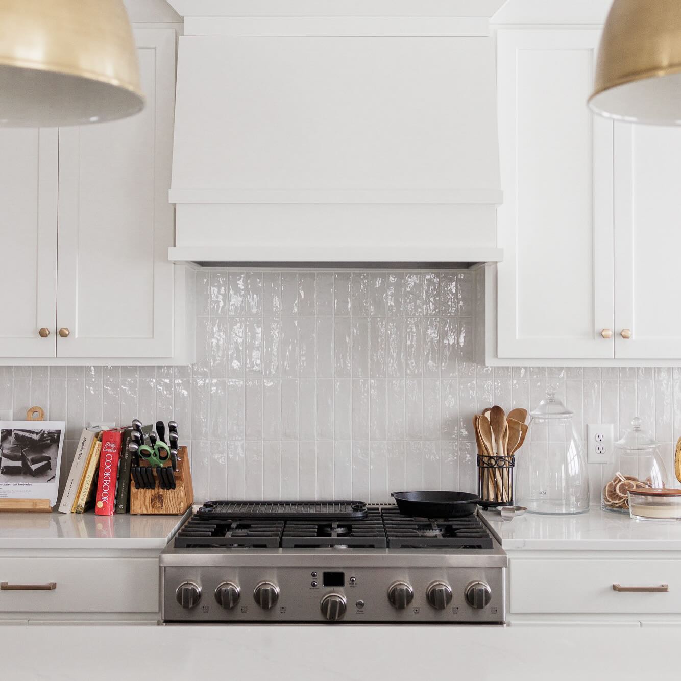
The move here is stacking the subway tile vertically instead of the usual horizontal run. It’s such a small change and it looks like a different tile entirely. The glossy, slightly uneven finish catches the brass pendants above the counter and bounces light back into the room. For a mostly white kitchen like this one, that bounce is the whole trick. The texture does what color would otherwise have to
What Keeps a Modern Kitchen From Feeling Cold
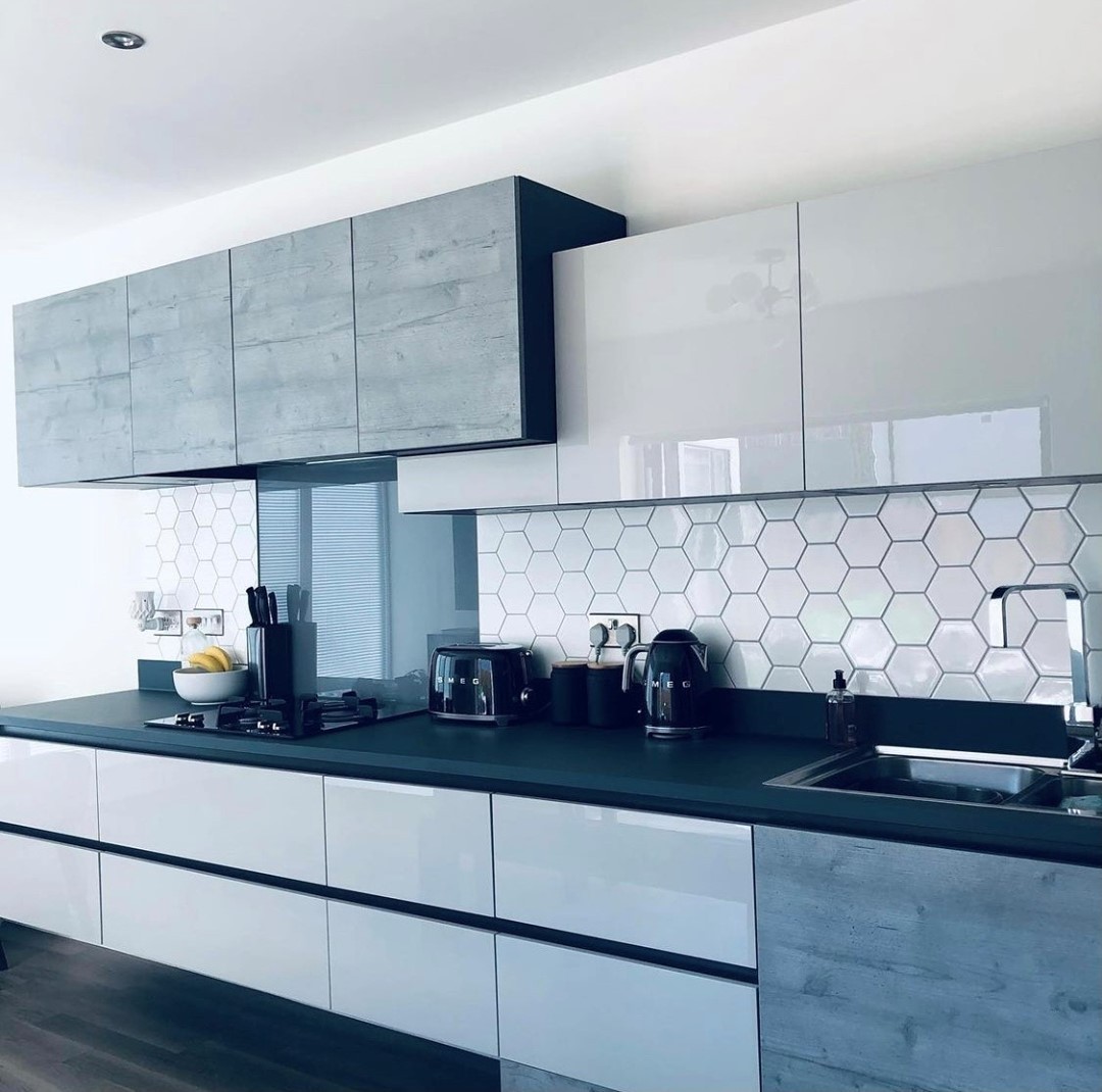
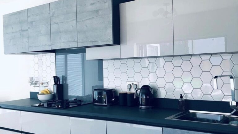
Flat-front cabinets and dark counters can tip into cold fast. The oversized white hexagon tile here keeps that from happening. Hexagons read as geometry instead of pattern, so they add interest without competing with the gloss finish on the uppers. The scale matters too: smaller penny hexagons would feel busy here, but these bigger ones hold their own against the horizontal lines of the cabinets.
The Grout Line Trick for a Luxe Look
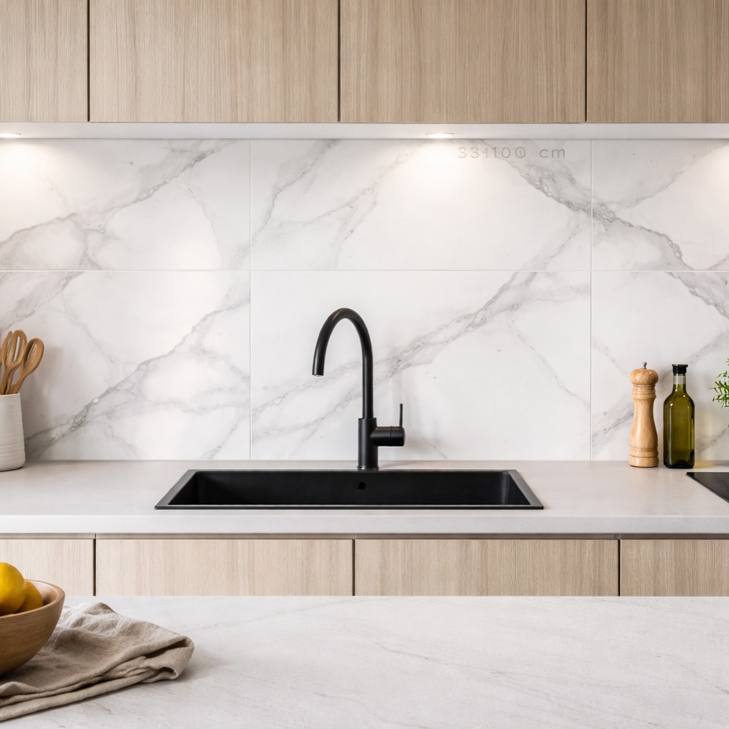
Grout lines are where backsplashes start to show their age, so cutting them down is the move. Large-format Calacatta tiles, the white stone with the gray veining running through it, do exactly that: just a few quiet seams across the whole wall instead of dozens. The black faucet and sink keep it from looking too precious, and the light wood cabinets keep the whole thing warm. This is the kind of kitchen update that looks expensive because it is, but it also stays looking that way for years without needing to be redone.
Which one of these kitchen wall tile ideas feels most like your kitchen?