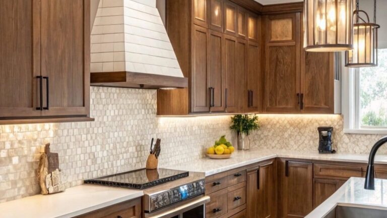
Purple isn’t the color most people reach for when they’re redoing a kitchen. That’s exactly why these ones stand out. These purple kitchens show what the shade can actually do when someone commits to it instead of playing it safe.
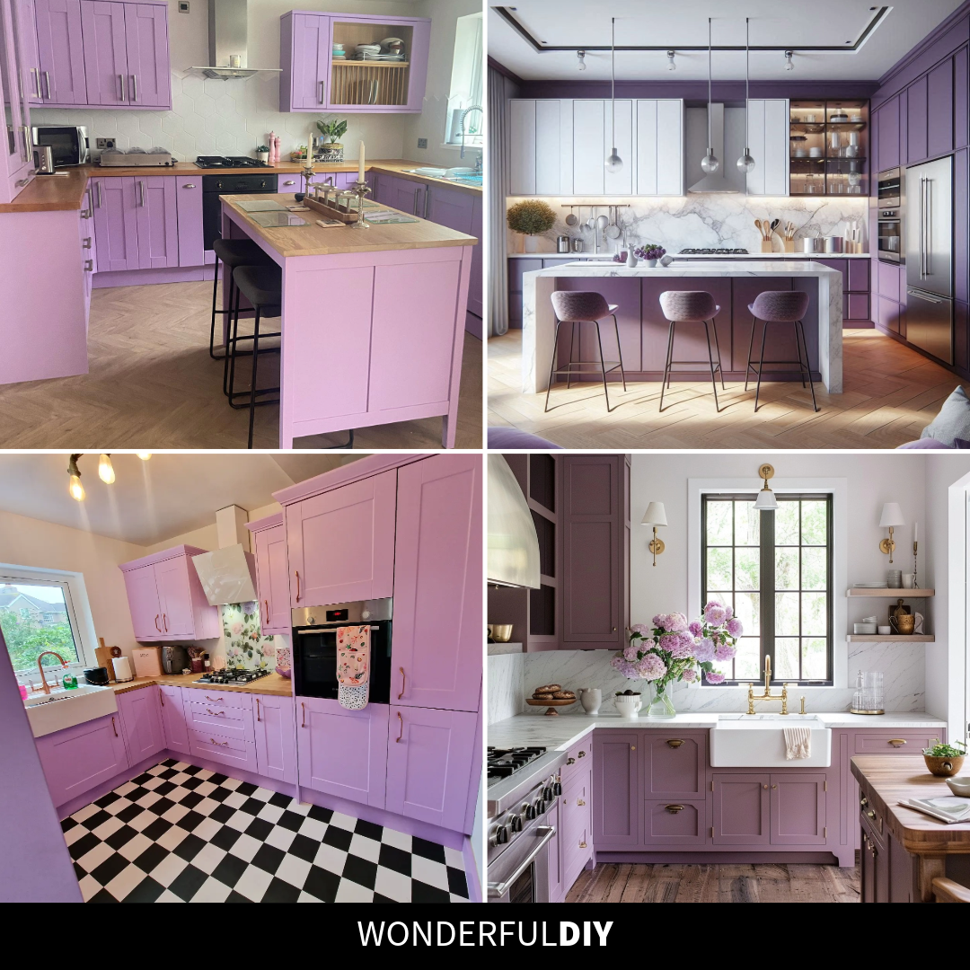
Purple Kitchens That Pull Off the Color Without Feeling Over the Top
Purple cabinets usually trigger one of two reactions: either it’s the kind of bold choice that pays off, or it’s a mistake someone paints over within a year. The difference comes down to three things, the exact shade, what the counters and floors are doing, and how much daylight the room gets. Get those lined up and purple reads sophisticated instead of childlike.
The kitchens below cover the full range: pale lilacs that read almost neutral, dusty mauves that lean warm, and deep aubergines that act like a dark navy. If you’re wondering whether the color could work in your own house, this list shows you exactly what it looks like when it does.
The Purple That Reads Like a Neutral
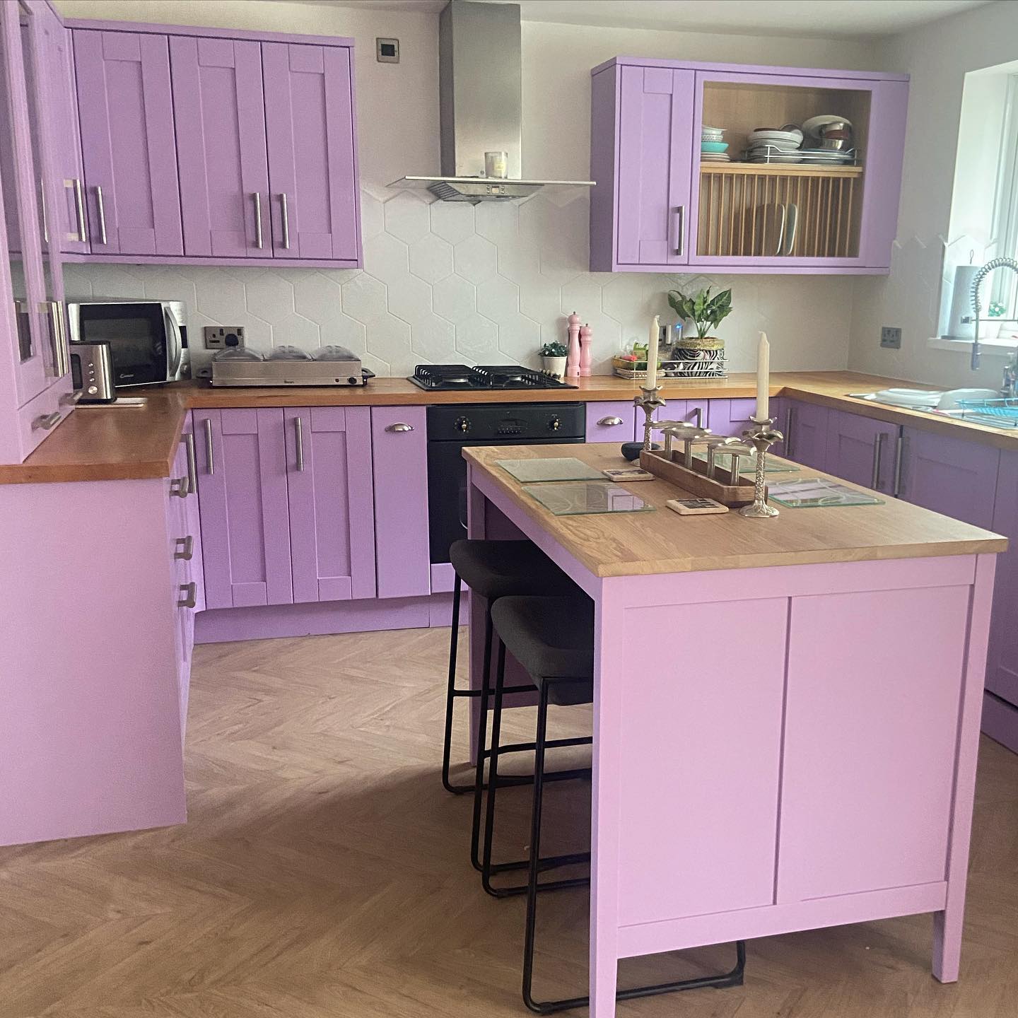
Pale lilac cabinets with warm butcher block countertops is the easiest way into this color. The wood pulls the purple toward soft and lived-in instead of trendy, and the small island in a slightly deeper pink keeps the whole thing from looking flat. If you’re not up for a gut renovation, repainting shaker fronts in a shade like this is the move that fakes a custom build on a weekend budget.
The Shade That Behaves Like Dark Navy
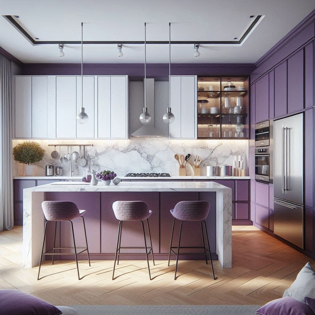
Deep aubergine is the version of purple that reads grown-up. It acts like a dark navy or forest green, moody enough to feel intentional, neutral enough to layer with brass and glass. The 3D textured white backsplash does most of the balancing work here, keeping the dark cabinets from closing in on the room. The glass-front uppers with stemware help too, breaking up what would otherwise be a wall of color.
When the Floor Does the Grounding
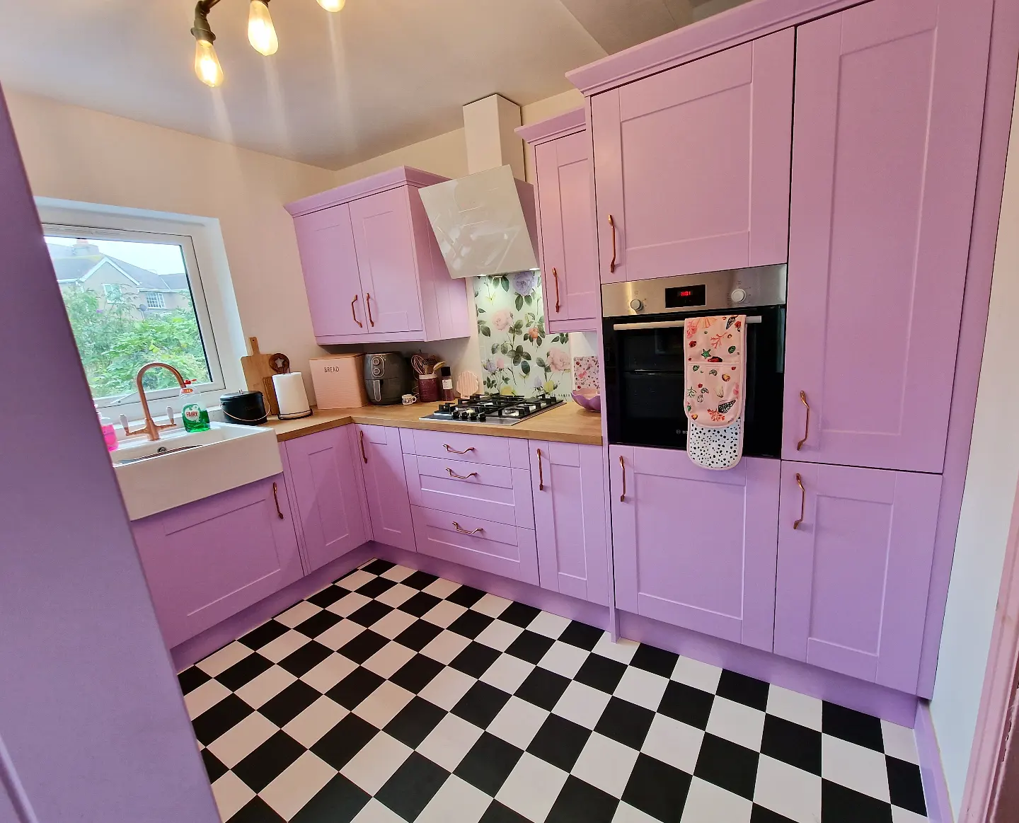
The black-and-white checkered floor is the move most people would skip here, and it’s exactly what keeps this kitchen from looking like a candy shop even though the cabinets lean toward cotton candy pink. The classic floor pattern grounds the whole room so the color on the cabinets can stay as sweet as it wants. The rose gold handles and floral backsplash finish the look without pushing it over the edge.
The Dusty Purple That Loves Marble
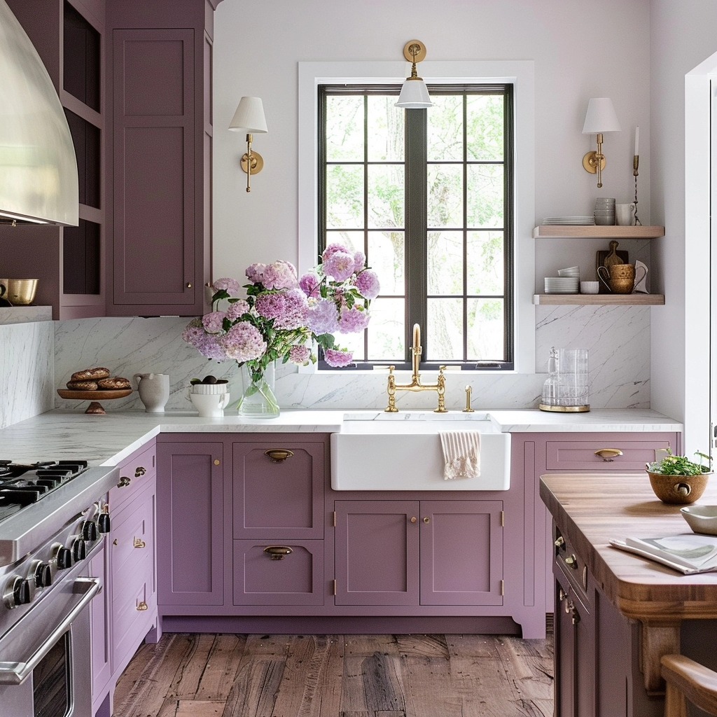
Dusty mauve sits in the middle of the purple range, not pale enough to read pastel, not dark enough to feel heavy. The white marble counters and backsplash cool it down so the color reads soft and considered instead of sweet. The brass bridge faucet and white farmhouse sink keep the room from going too modern, and the open wood shelves add warmth right where the eye lands. The kind of kitchen that photographs well on a cloudy day.
The Lavender That Still Reads Modern
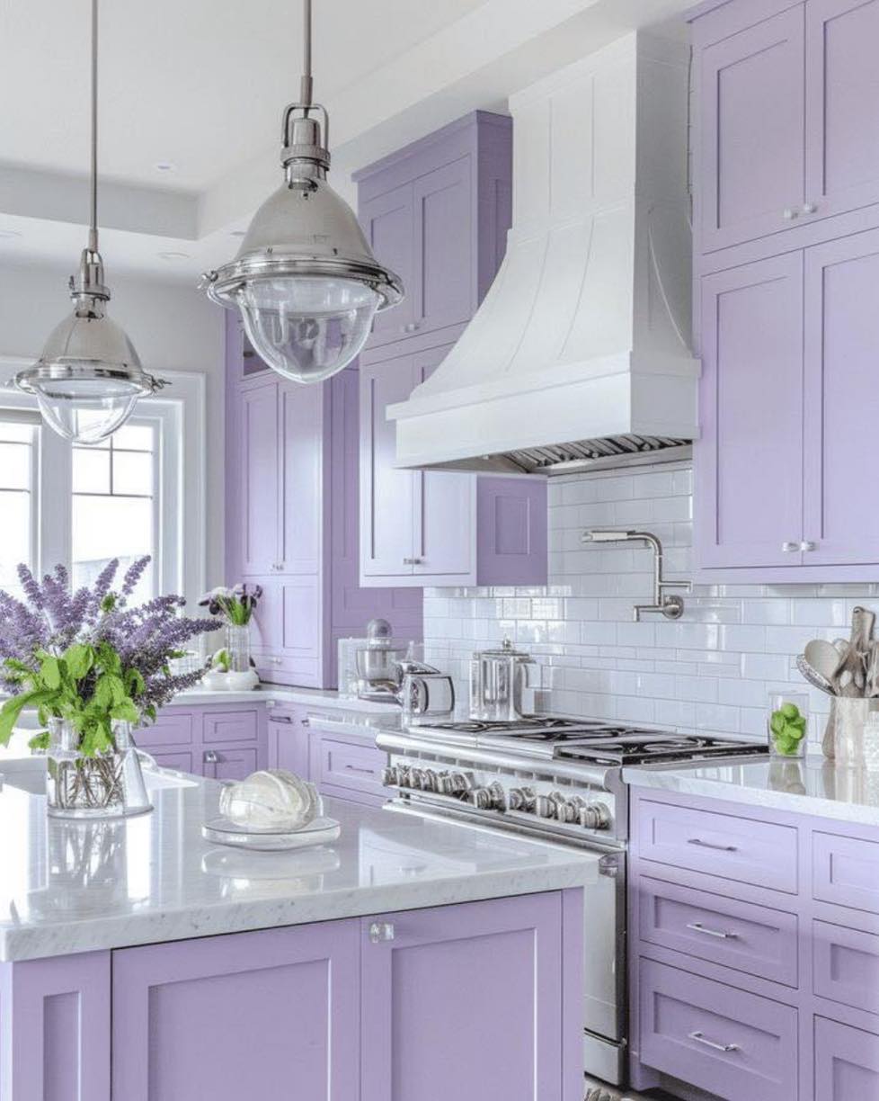
Lavender gets a bad reputation for being too soft, but when you pair it with a crisp white range hood and chrome dome pendants, the room reads bright and current instead of flowery. The subway tile backsplash and marble island keep everything feeling clean, so the lavender has room to breathe. This is the version to copy if your kitchen gets a lot of natural light and you want to use it.
The Purple That Gets Dressed Up
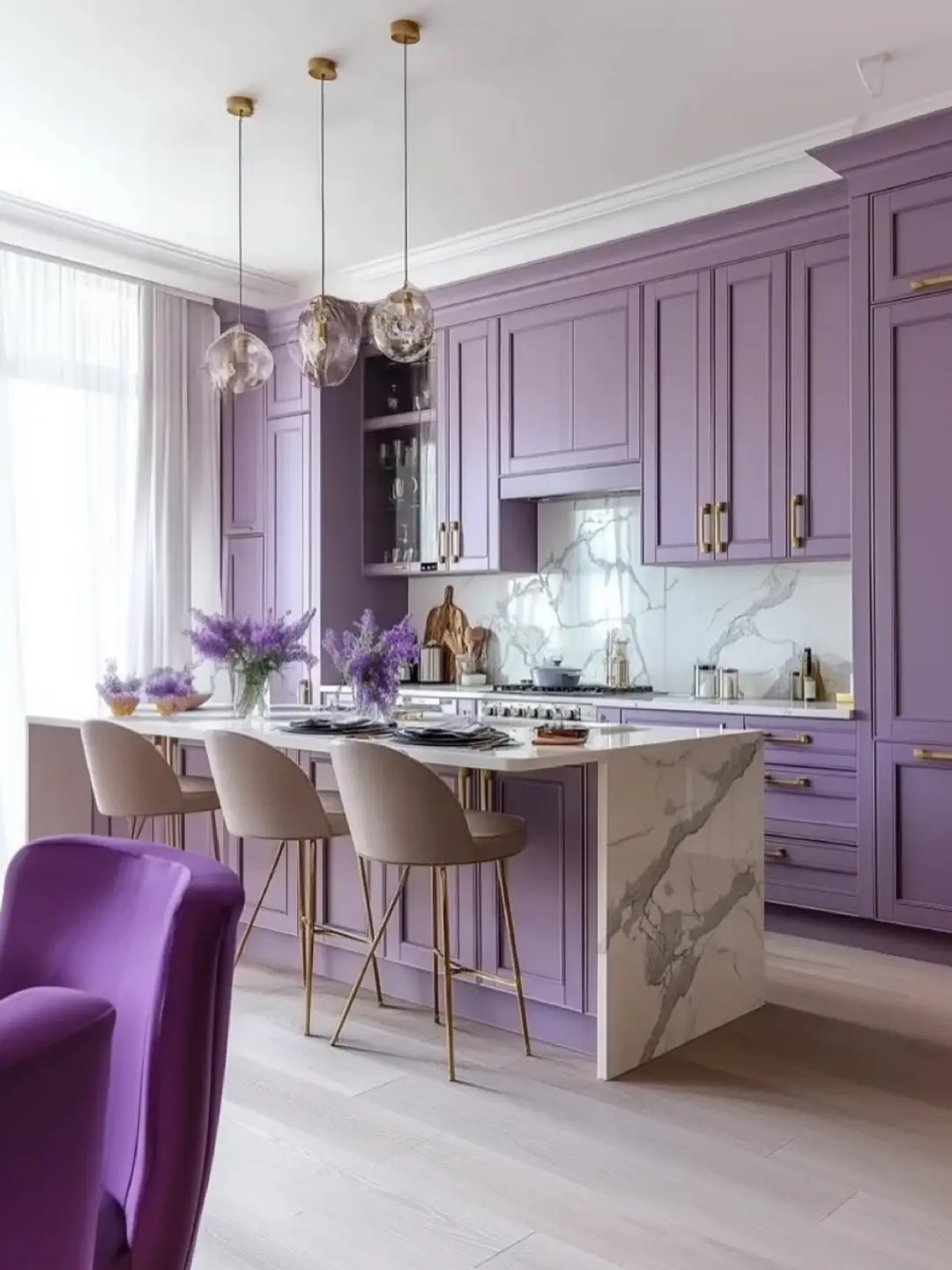
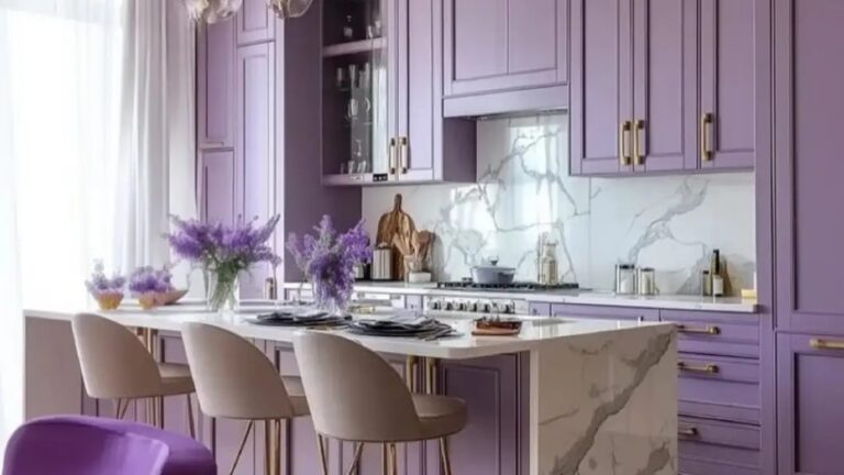
Here the color gets a proper evening wardrobe: three brass globe pendants, a veined marble waterfall island, cream velvet bar stools with brass legs. The purple cabinets go floor to ceiling with no breaks, which is what makes the room feel like a committed design decision rather than an accent moment. If you’re thinking about painting cabinets instead of replacing them, going all-in on one bold color like this is the move that reads most expensive.
Which shade of purple would you actually try in your own kitchen?