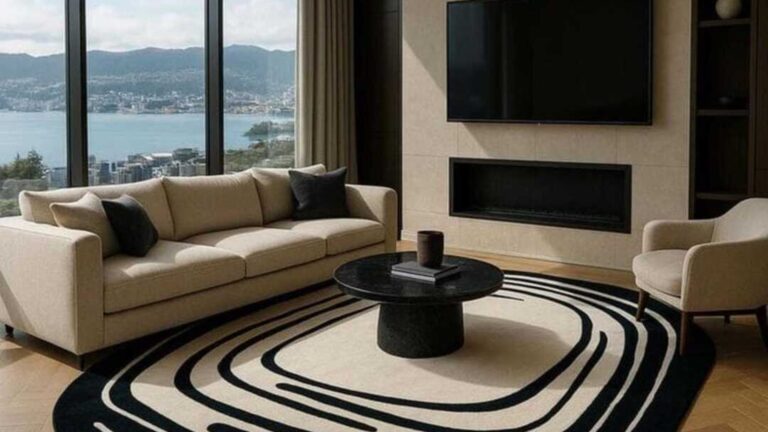
The color on the walls shapes everything else in a living room. The furniture reads differently, the light shifts, and a space you walk through every day suddenly earns a second look. These living room wall color ideas go past the usual safe picks and show what the right choice can actually do.

Living Room Wall Color Ideas Pulled From Real Homes
Most living rooms end up some version of beige, gray, or off-white because it feels like the safe pick. The problem is “safe” also reads as “nothing to see here,” and the room never quite pulls together. The right wall color is what fixes that.
Each of the ideas below works for a different kind of room and a different kind of light. Some are moody and dark, some soft and warm, and a couple are the kind of color most people wouldn’t try without seeing it done well first. Scroll through and see which one sounds like your room.
Deep Color That Still Reads Like a Neutral
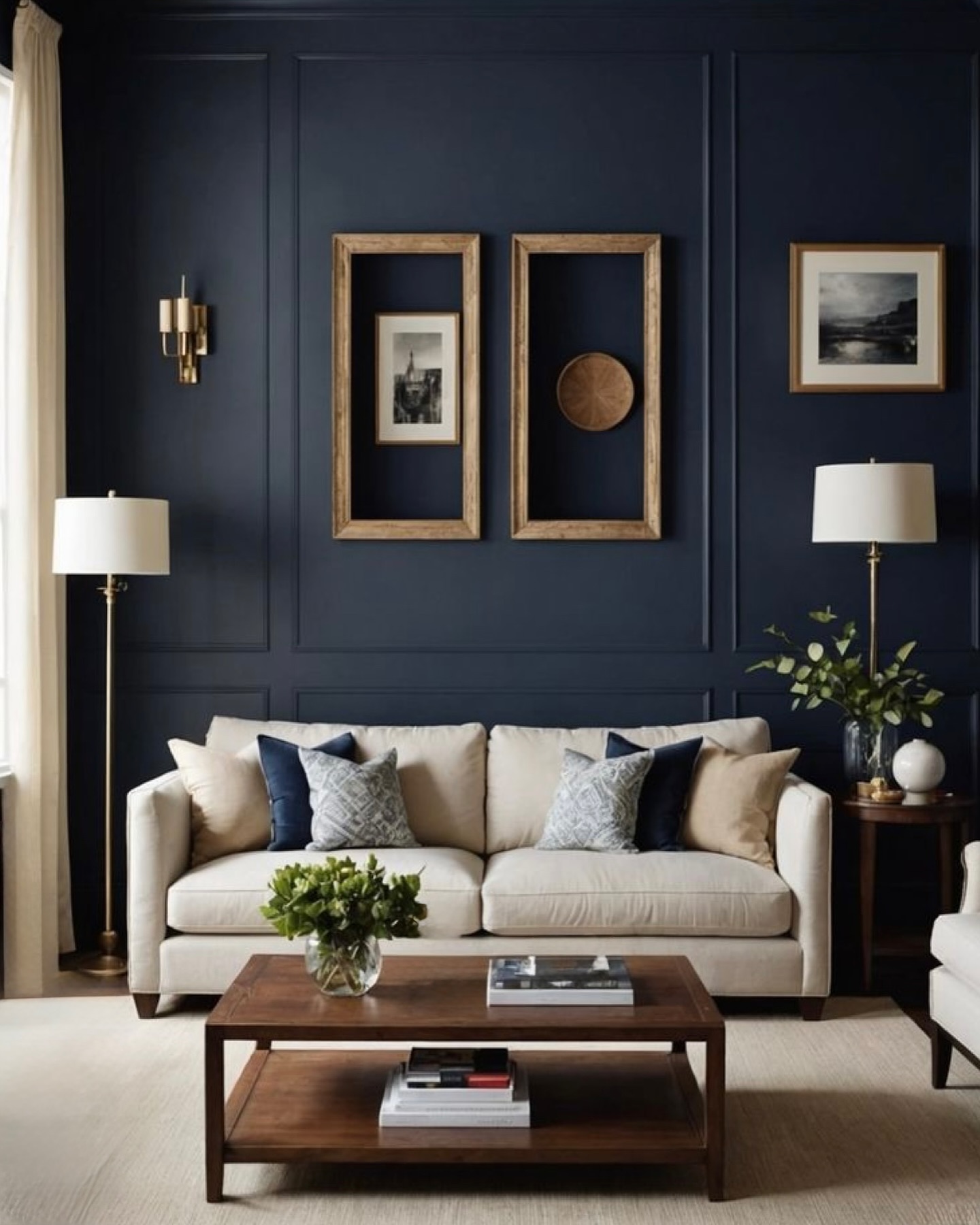
Navy pulls off what gray can’t: it feels rich without feeling dark. Panel molding adds that custom-home polish, and the cream sofa with wood-framed art keeps it from going stuffy. Stick to the one wall behind the couch, not all four, or you’ll chase the light out. These living room wallpaper ideas are a useful side-by-side if you’re deciding paint versus pattern.
Moody Walls That Still Feel Warm, Not Cold
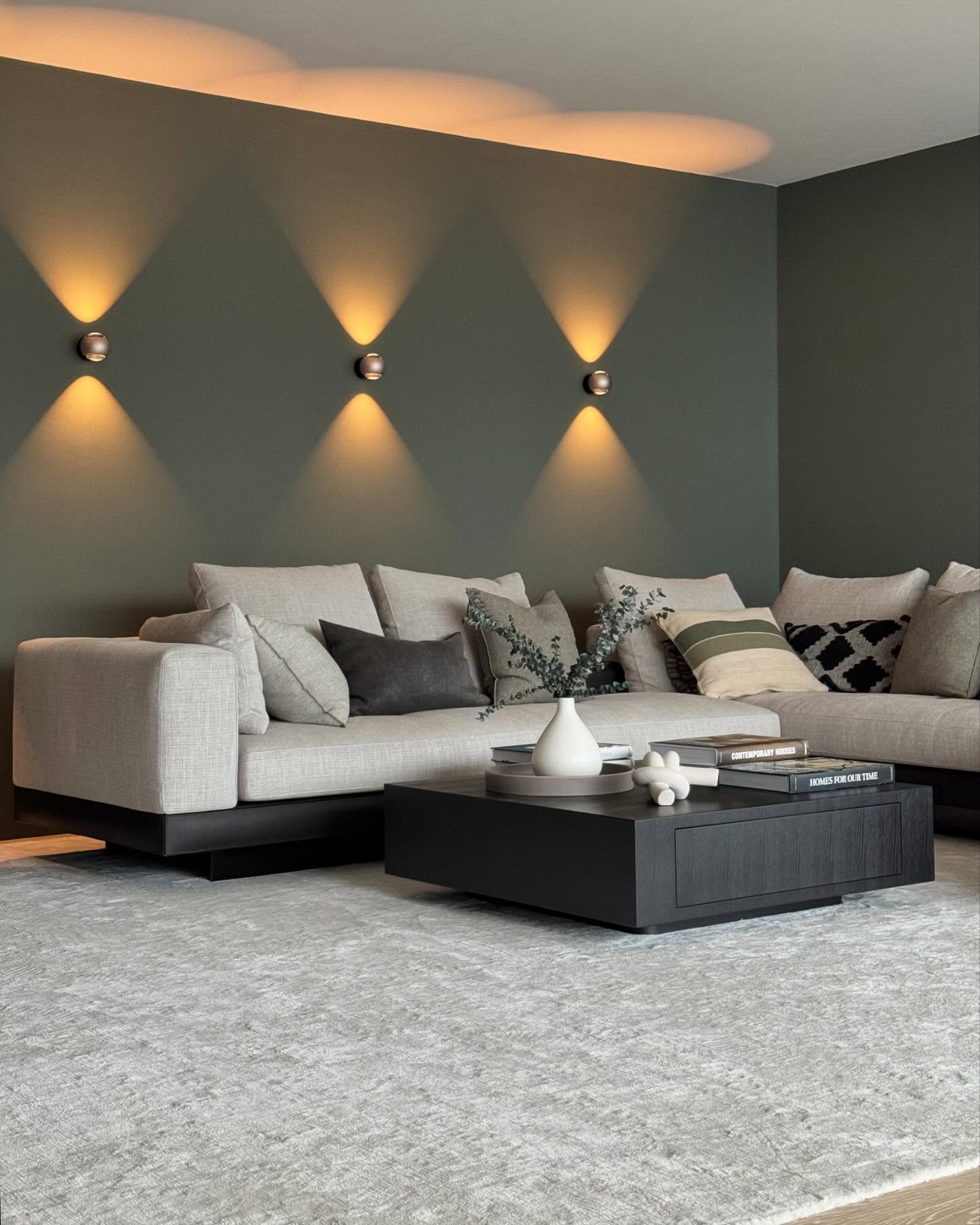
Dark green sits in a sweet spot on the color wheel: deep enough to feel moody, warm enough that it doesn’t go cold like black or charcoal. The real move here is the up-down sconces throwing diamond-shaped light. That lighting is what makes this wall look expensive. Pair with a soft gray sofa and the whole room reads like a quiet hotel bar at 9pm.
A Lighter Green for Rentals and First Homes
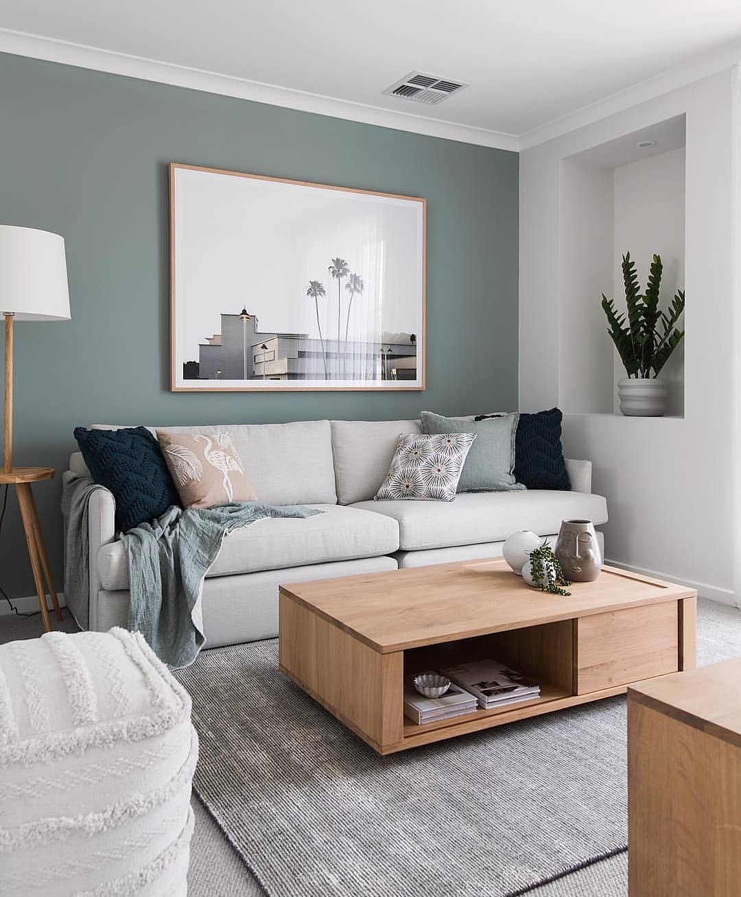
Soft sage reads neutral in bright light and almost blue when the sun goes down. It plays nicely with white trim, light wood, and gray upholstery, which is already most people’s starting point. Nothing in the room has to change if you repaint this way. Just one wall and the whole space picks up a quieter, more pulled-together feel.
Warm Beige for a Chilly Living Room
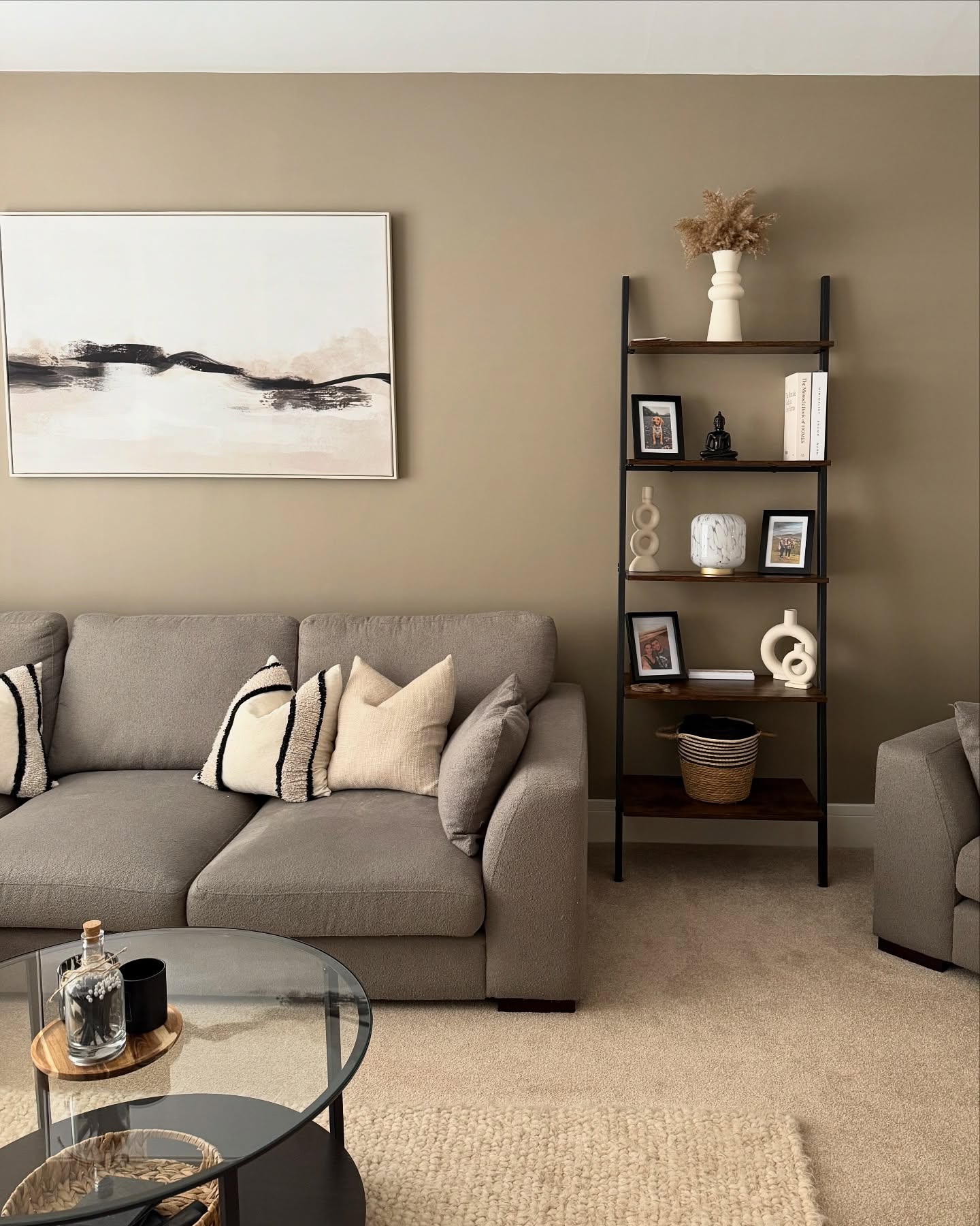
If your living room gets north-facing light or goes blue by late afternoon, warm beige is the fix. It has brown and a touch of pink in it, so it reads warm even on cloudy days. The ladder shelf and black-and-cream art show how beige stops being boring when you layer darker pieces against it. Try a swatch before you commit to all four walls.
Living Room Color for Brass and Gold Lovers
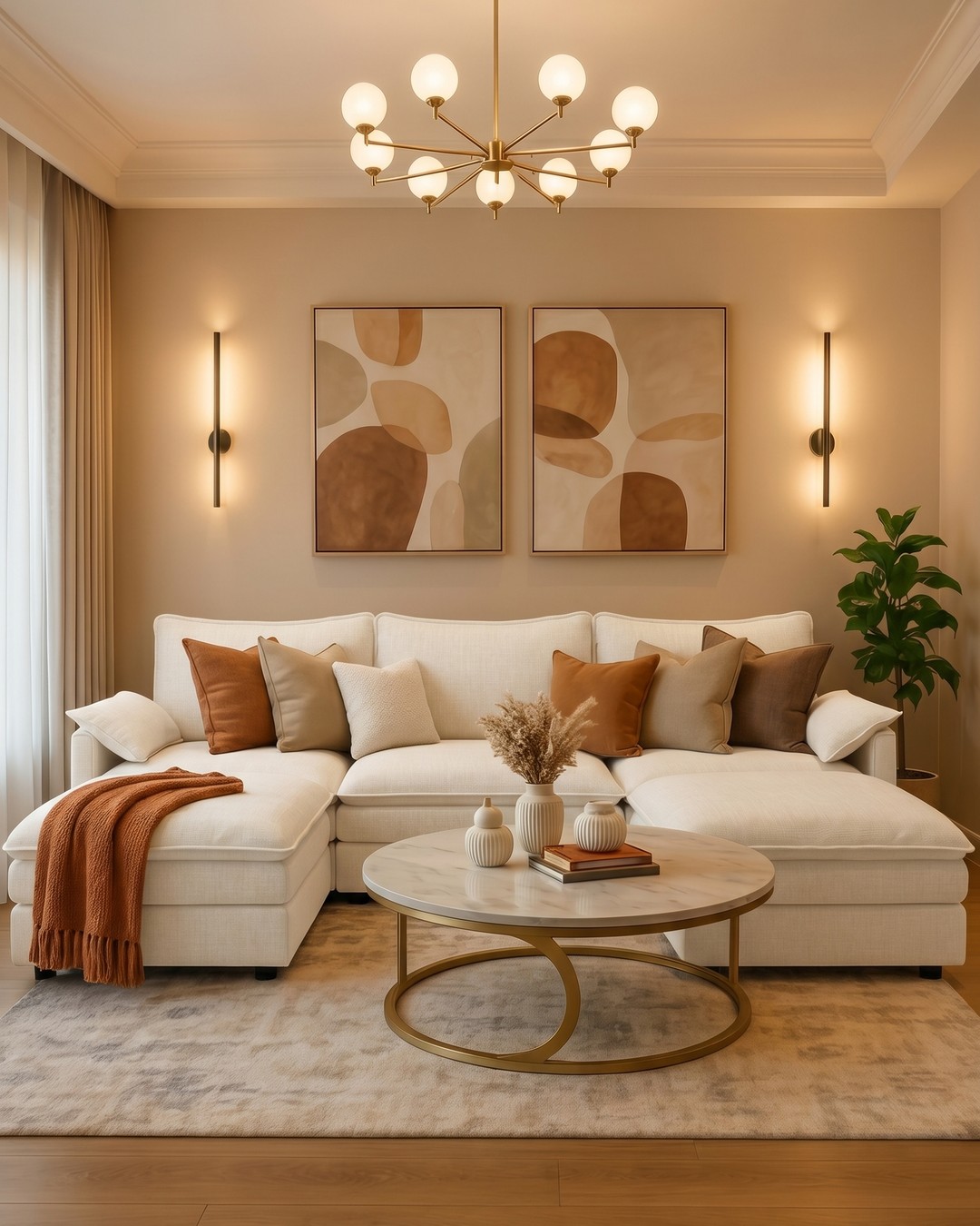
Warm beige and brass are made for each other. The wall gives the chandelier and sconces something to glow against instead of fading into. Rust pillows and the terracotta throw tie it together without matching too hard. If you have brass hardware anywhere, this set of modern living rooms uses the same warm-metal approach you can borrow from.
Brown Walls Without the 1970s Flashback
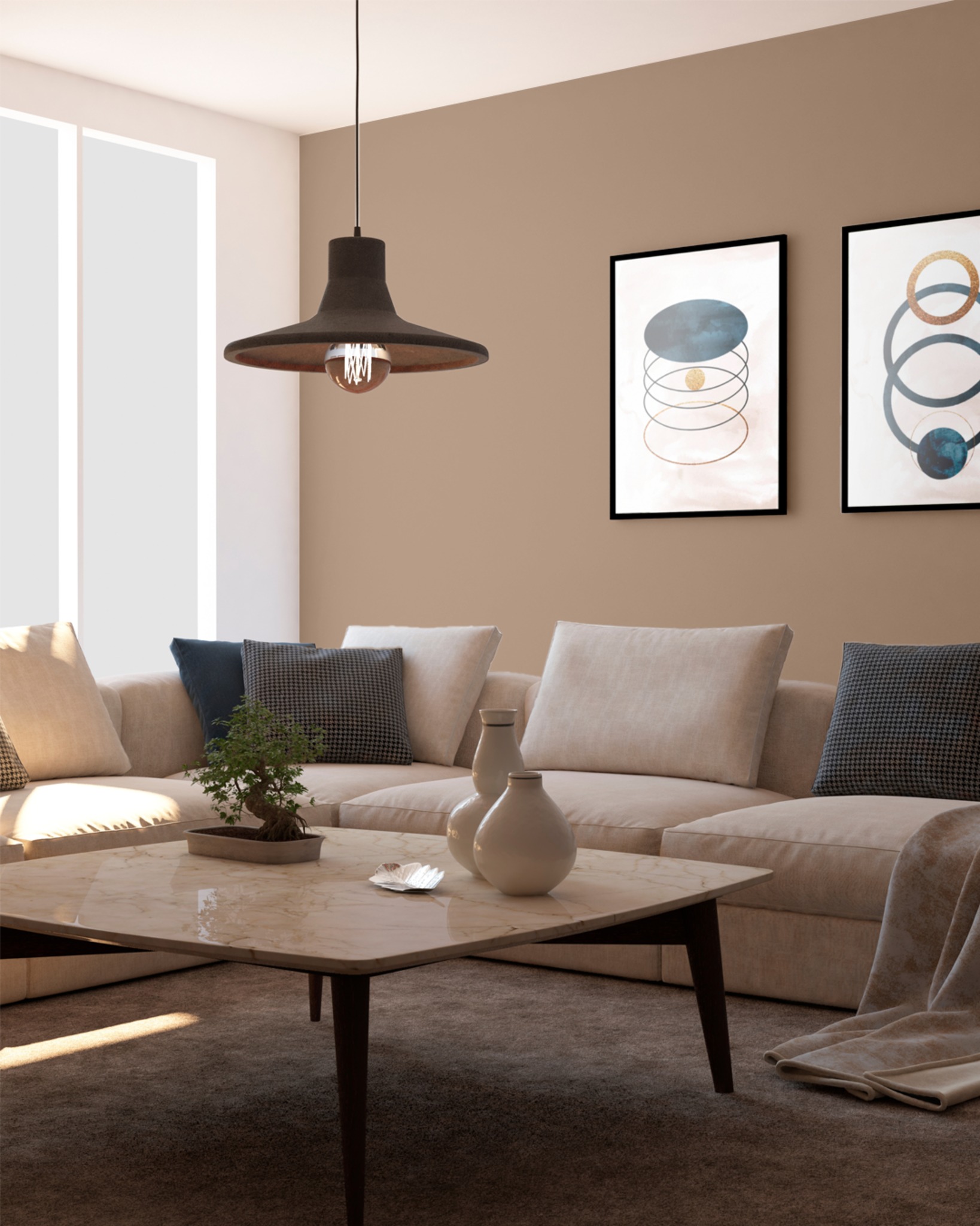
Brown got a bad reputation from decades of dim wood paneling, but today’s warm mocha reads closer to coffee than to a basement rec room. The trick is keeping everything else light: cream sectional, abstract art with blue accents, a marble coffee table. The brown becomes the backdrop, not the whole mood. Works best in rooms with at least one big window.
A Grown-Up Neutral Without Going Flat
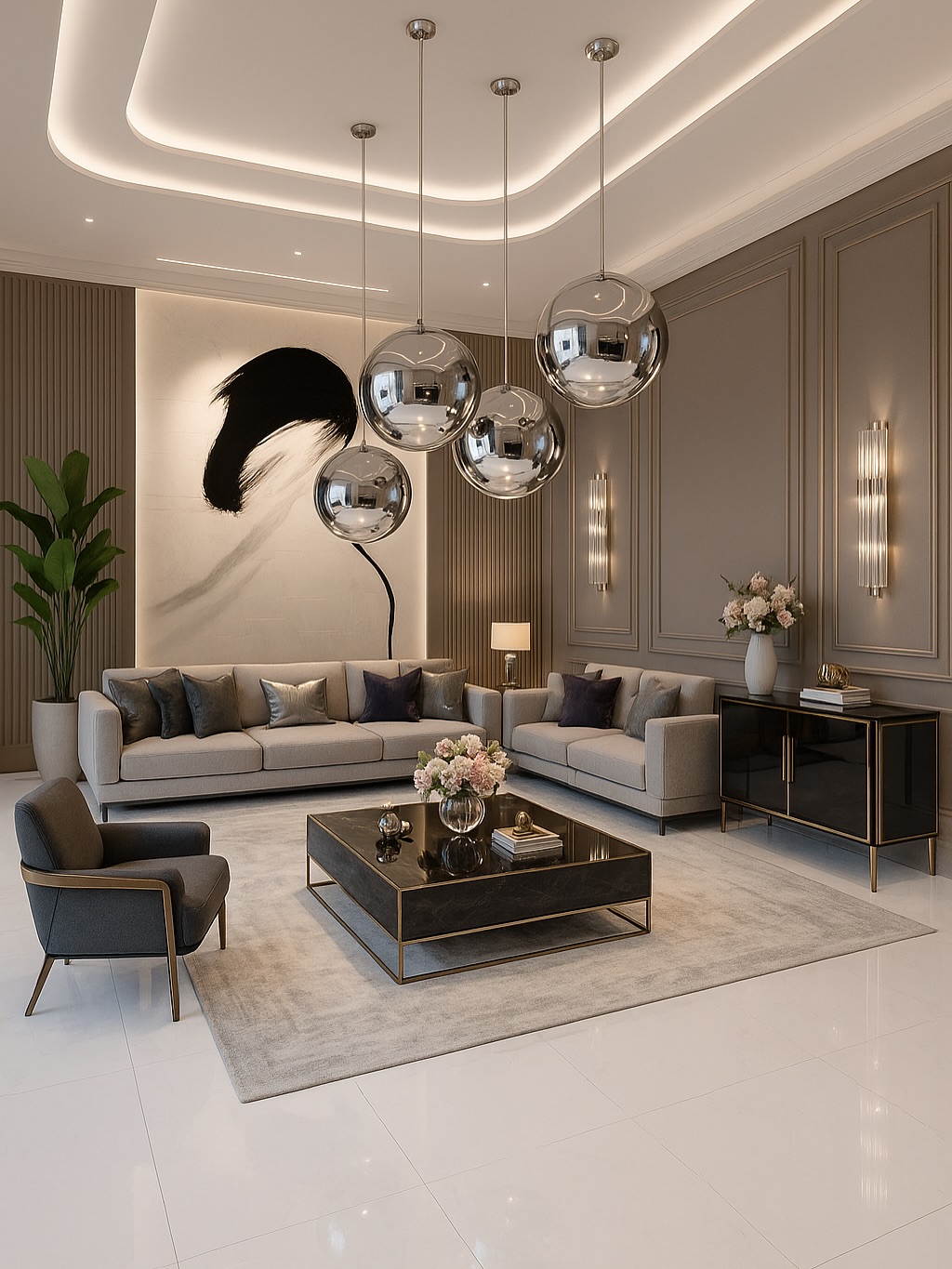
Greige, which is just gray with a bit of brown mixed in, gives you a neutral that doesn’t go flat. The panel detailing adds some depth, and the silver orb pendants pop against the warmer wall instead of blending in like they would on plain white. This is a safe pick if you share the house with someone who hates committing to color but you still want the room to feel designed.
Pastel Walls Done the Grown-Up Way
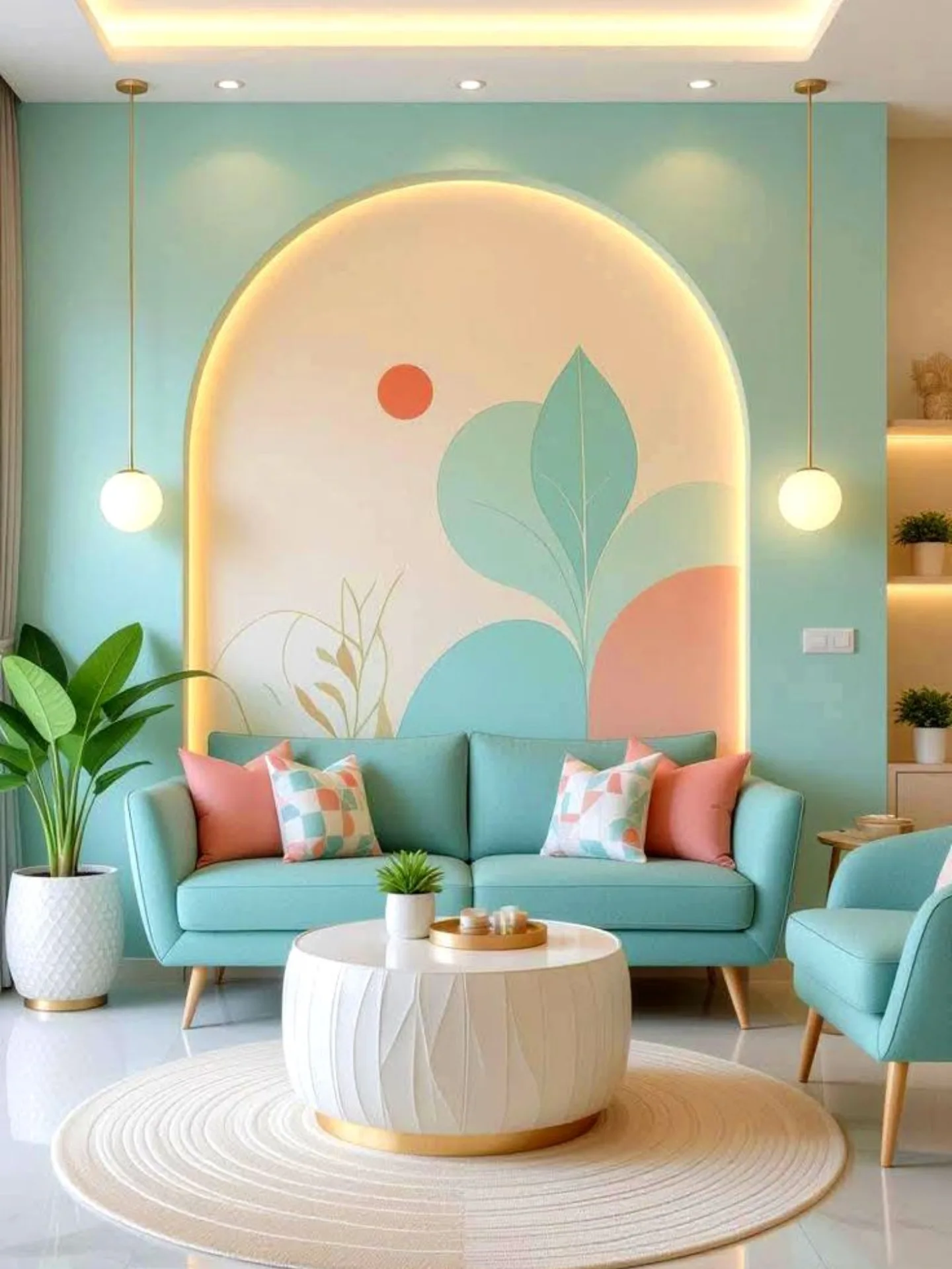
Mint pastel sounds like a kid’s room color until you see it with coral pink pillows, brass pendants, and a round jute rug underneath. The arched mural with soft leaf shapes gives the wall something to say without wallpaper or framed art. If your style leans soft and playful but you still want it to read grown-up, this is the direction. Good for small rooms that need to feel brighter.
Teal Walls That Make Wood Look Warmer
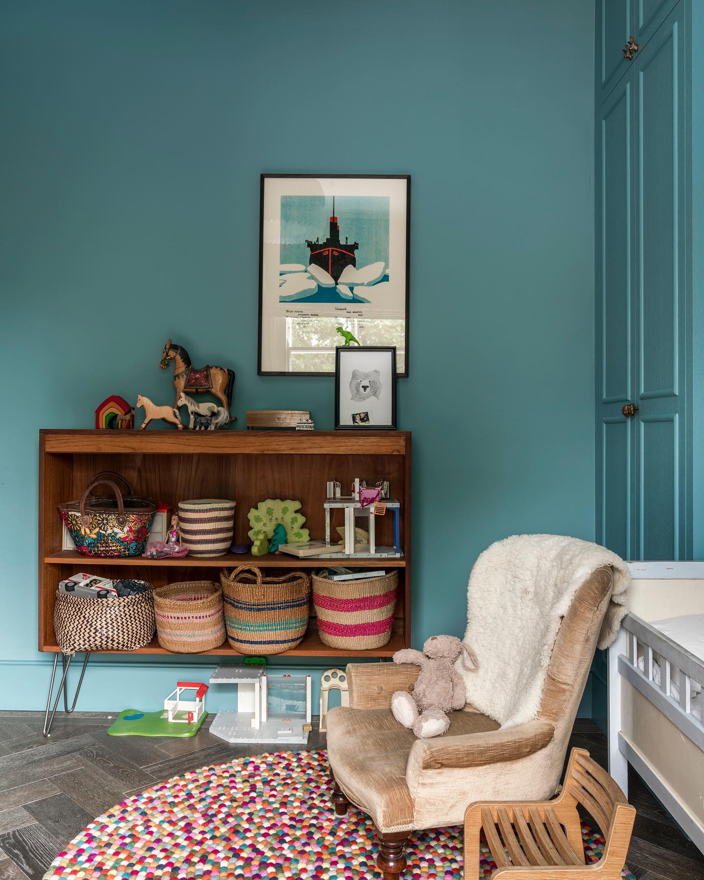
Deep teal does something gray and beige can’t: it makes wood look like wood again. Oak, walnut, even cheap pine stop fading into the background and start showing their grain. Carry the color across to the built-in trim and everything holds together instead of looking patchwork. Pair with a white ceiling so the color doesn’t swallow the space.
Which of these wall colors could you actually see in your own living room?