Blue bathrooms have a bad reputation in American homes, and most of us know exactly why. There was a stretch where the color got done so poorly it tanked the whole category. These bathrooms are a quiet argument that the problem was never the blue itself.
Blue Bathrooms That Make the Case for the Color Most People Keep Avoiding
Blue got filed away as a 2000s mistake for a reason. Flat navy walls, shiny brass fixtures, oak vanities trying to be country: the combination became shorthand for “I renovated in 2004 and never touched it again.” Blue didn’t go out of style, though. The way people were using it did.
What’s below is a different approach: blue in all its shades, paired with real wood, real brass, and real stone, in ways that look like now instead of then. Here are 7 bathrooms worth saving if you’ve been thinking about the color but weren’t sure how to make it work.
Blue That Finally Feels Like a Room, Not a Theme
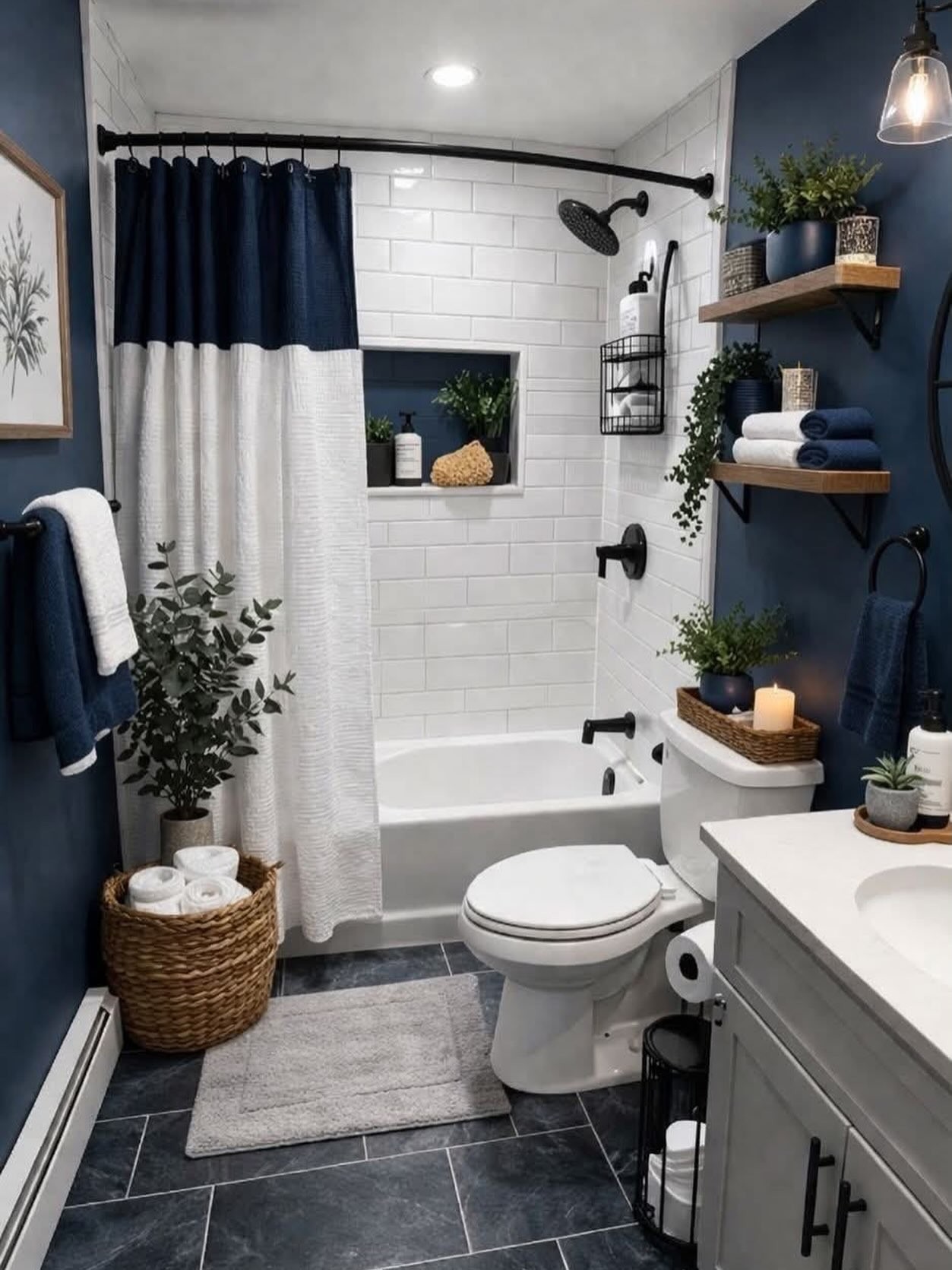
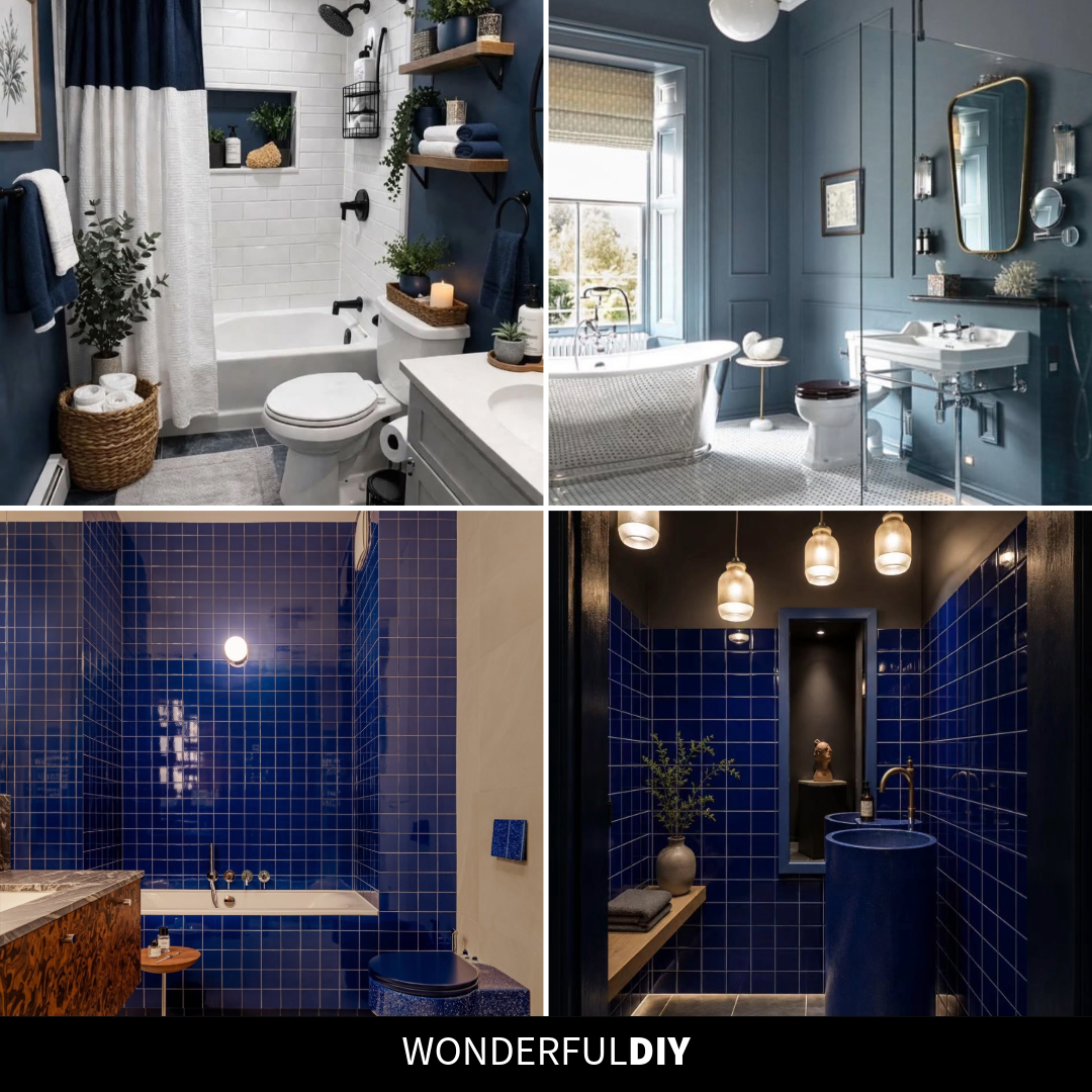
The move most people miss with navy walls is giving them something warm to lean on. Those wood shelves on the right are what keeps the whole bathroom from feeling cold or sad. Pair them with real plants, a white subway tile shower, and a slate floor, and you’ve got a room that looks pulled together without looking fussy. If this is the direction you’re thinking about, our grey bathroom looks is worth bookmarking.
Deep Blue That Belongs in an Old House
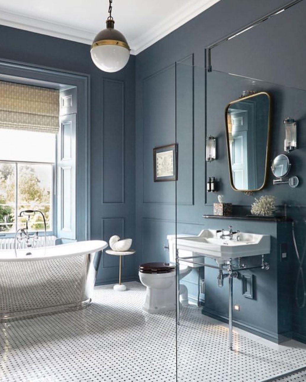
Old-house bathrooms usually get painted white because people are scared of making the room feel smaller. This one proves the opposite can work: a deep blue-gray on the walls makes the room feel more settled, like it was always supposed to look that way. The paneling catches shadow and gives everything more depth, and the clawfoot tub stops reading as fussy because the color behind it has some weight.
Why Cobalt Reads Modern Instead of Mediterranean
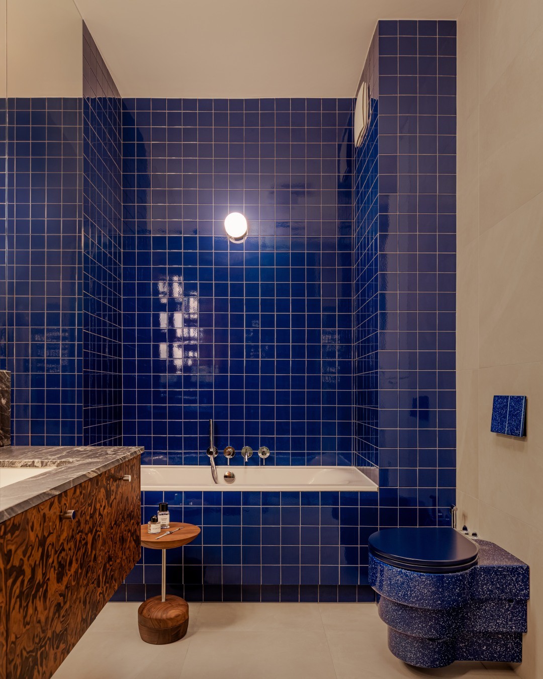
Grid tile in a bold color used to scream 1980s kitchen. The reason this version reads modern is the grout: kept thin and matched close to the tile color, so the wall registers as a single cobalt surface instead of a loud grid pattern. The burl wood vanity underneath is what grounds it, and the speckled toilet is the kind of detail that makes the whole room feel designed on purpose instead of pieced together.
Dark Blue Done Without the Nautical Hangover
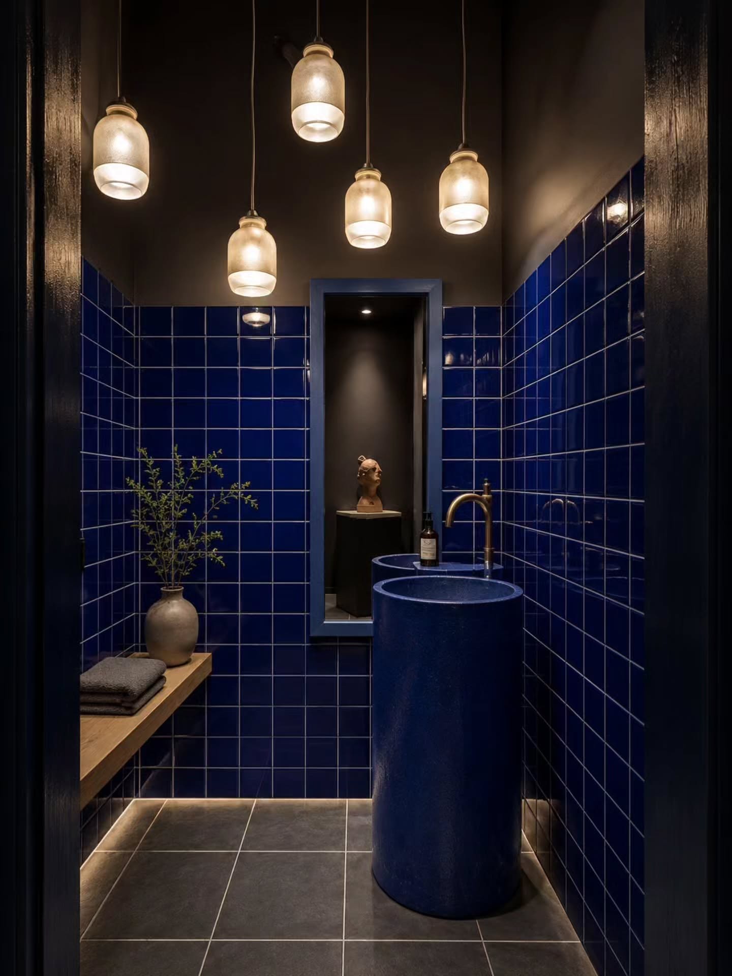
Dark blue walls in a small bathroom should feel like a cave. This one doesn’t, and the reason is lighting: a cluster of small amber pendants spread across the ceiling instead of one flat overhead fixture. Each one carves out its own pool of warm light, which keeps the color feeling dramatic rather than depressing.
Blue You Can Try Without Committing to a Full Redo
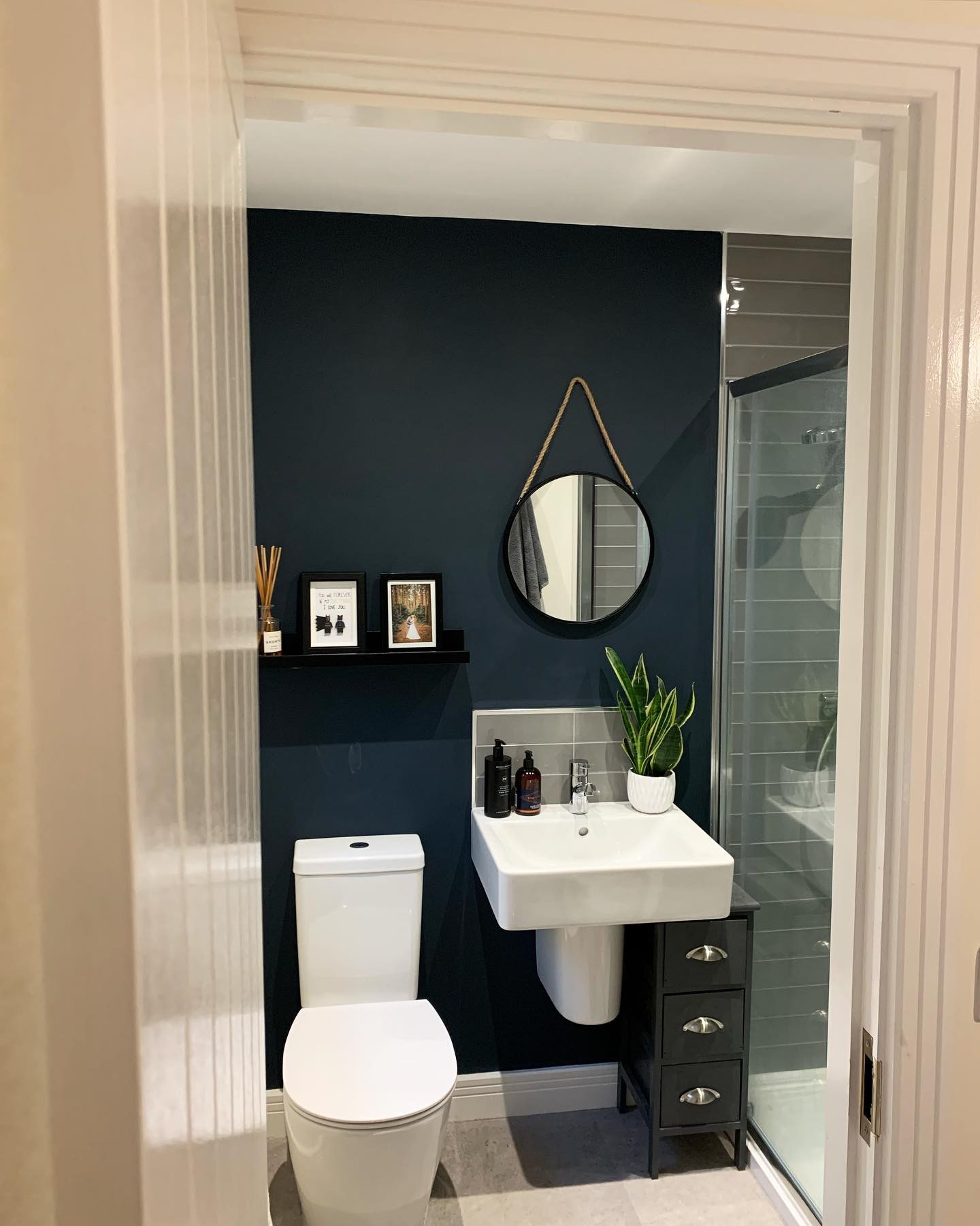
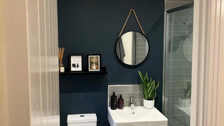
If a full navy bathroom feels like too big a swing, one wall is where you start. The payoff here is high and the commitment is low: a single accent wall behind the toilet, two framed prints on a shelf, a rope-hung mirror, nothing else. The rest of the room stays neutral so the blue has somewhere to breathe.
Which of these would you actually try in your own bathroom?