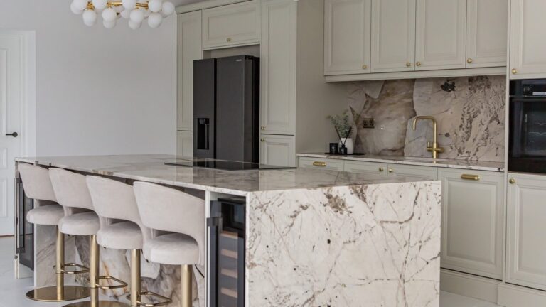
Most people walk into a kitchen like this and think there’s only one way out. Rip out the cherry wood. Paint everything white. Swap the dark granite for pale quartz. Call it done.
She didn’t do that. And her kitchen looks better than almost every all-white flip on the internet right now.
The whole project came in at $40,000. That’s $19,500 on cabinets, $10,000 on counters, $5,000 on appliances, $2,000 on the sink and faucet, and about $1,000 on hardware. For a kitchen that reads like it belongs in a design magazine, that number is almost rude.
Here’s what she actually did, step by step.
The before was a time capsule from 2005
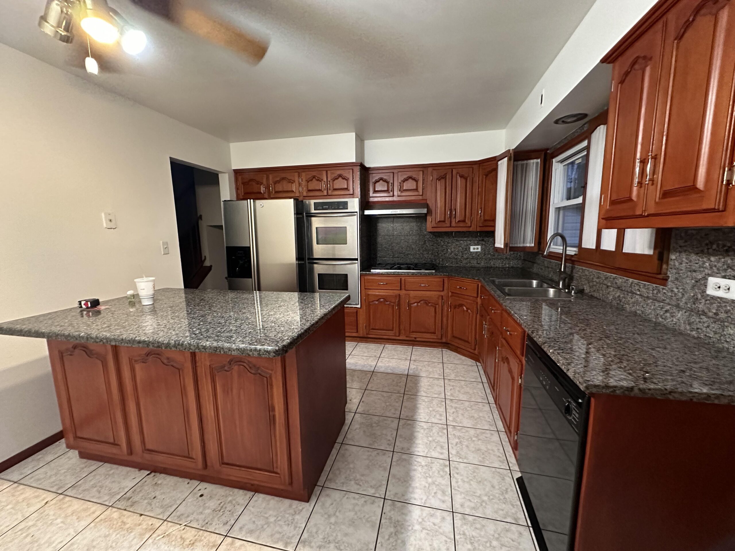
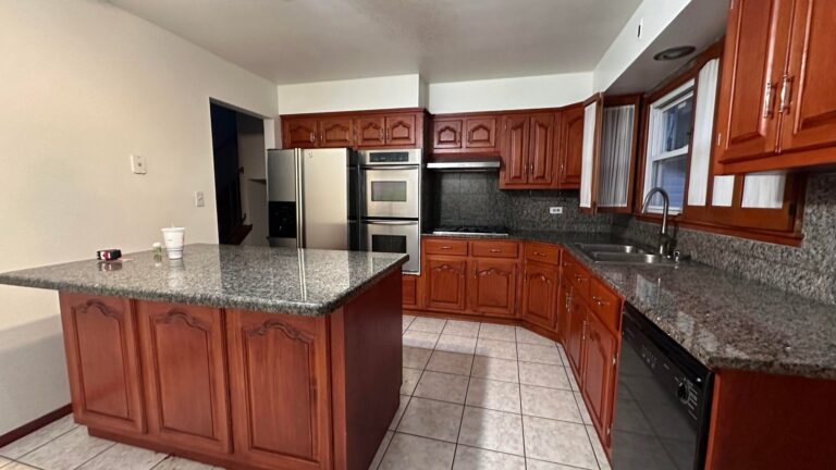
The old kitchen had every signature of that era. Cherry wood cabinets with arched raised panels. Speckled dark granite counters. Beige tile floor. A boxy soffit squeezing the ceiling. A clunky double wall oven stuffed right next to the fridge. An island that was really just a block of cabinets with no seating and nowhere to actually sit and eat.
Nothing was broken. Everything just felt heavy and loud. The red-orange wood tone pulled all the warmth out of the room in the wrong way, and the arched doors made the whole space feel older than it was.
She skipped the all-white trap
The easy move would have been to paint every cabinet bright white. That’s what Pinterest tells you to do. It’s also why every renovated kitchen on your feed looks exactly the same.
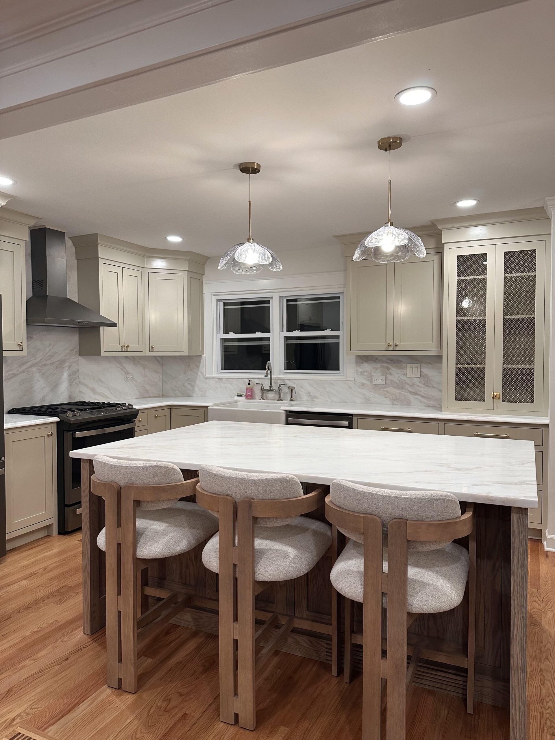
Instead, she went two-tone. The perimeter cabinets are a soft warm greige, close to a creamy taupe. Not white. Not cream. Something warmer, with real color in it. The island stayed wood, in a soft brown stain where you can still see the grain.
That one choice is the whole story. Keeping wood on the island is why the room still feels like a home instead of a showroom.
The marble is doing heavy lifting
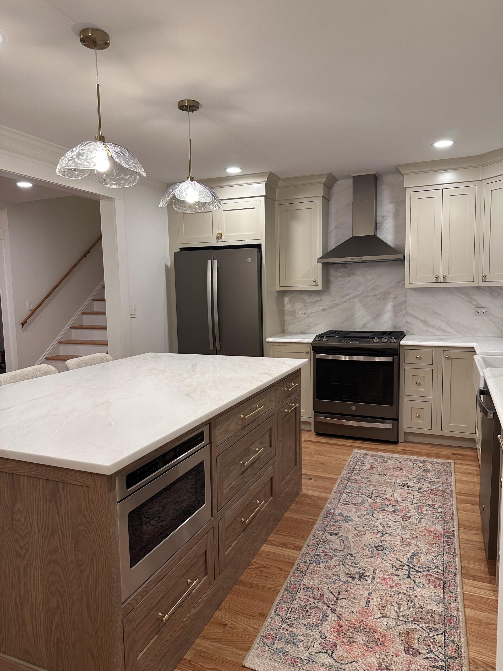
She picked Bianco Namibia marble for the counters, and she ran it all the way up the wall behind the stove as a full slab backsplash. No tiny four-inch strip. No subway tile. Just one clean sheet of marble from counter to ceiling.
That slab-to-ceiling move is what designers do in $150K kitchens. It costs more than tile, but it looks like money the second you walk in. The soft gray veining on the marble also ties the taupe cabinets and the wood island together without any color feeling out of place.
Brass hardware, not black, not chrome
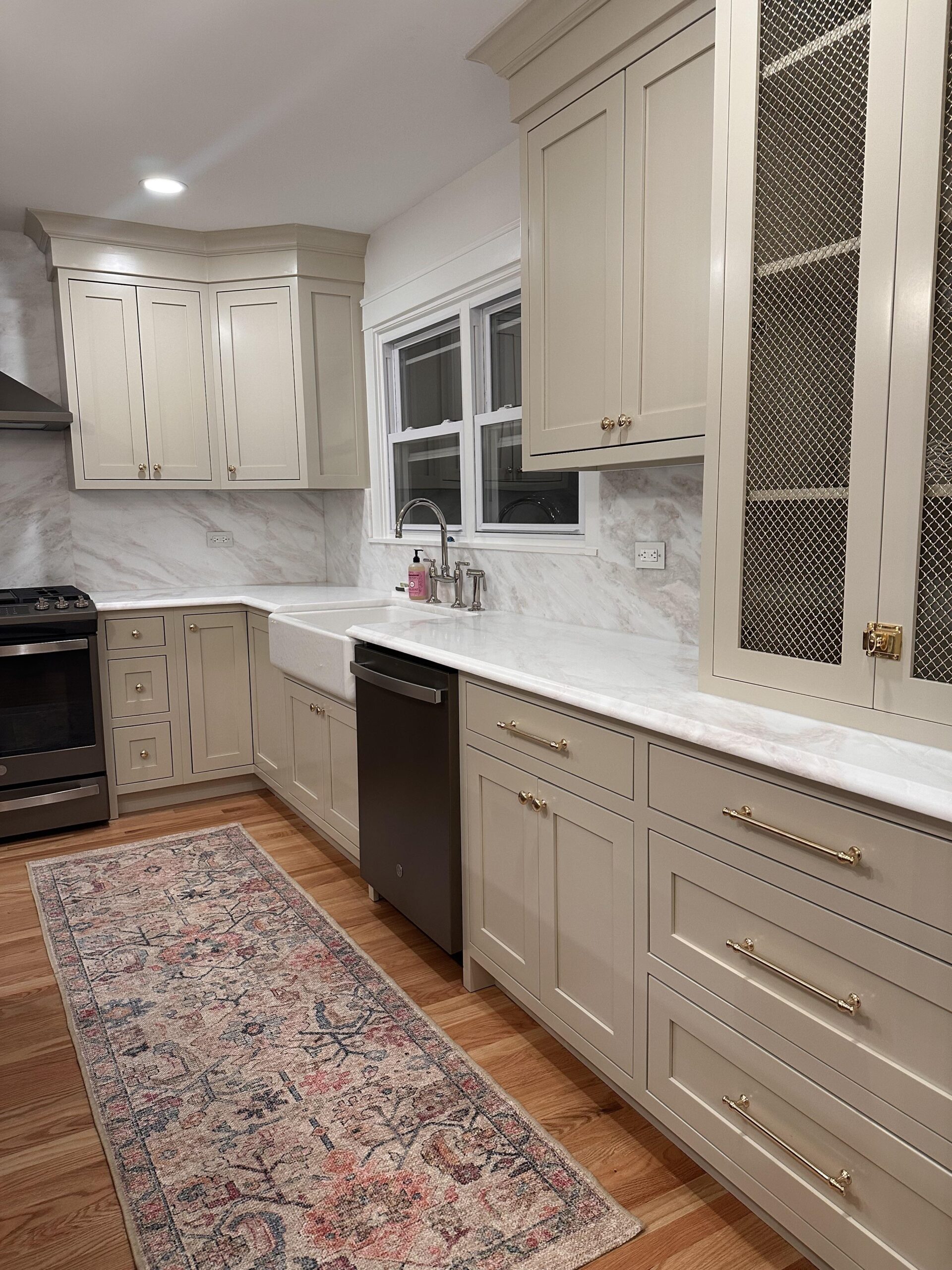
The pulls are warm brass. Long bar pulls on the island, slim pulls on the perimeter drawers, small round knobs on the uppers. Brass has been the designer default for a few years now, and it’s the right call here. Chrome would have felt cold against the taupe. Matte black would have fought with the wood.
The faucet is polished nickel, not brass, which is a small risk that pays off. It gives the sink area its own little moment instead of blending into everything else.
The lights, the rug, the little stuff
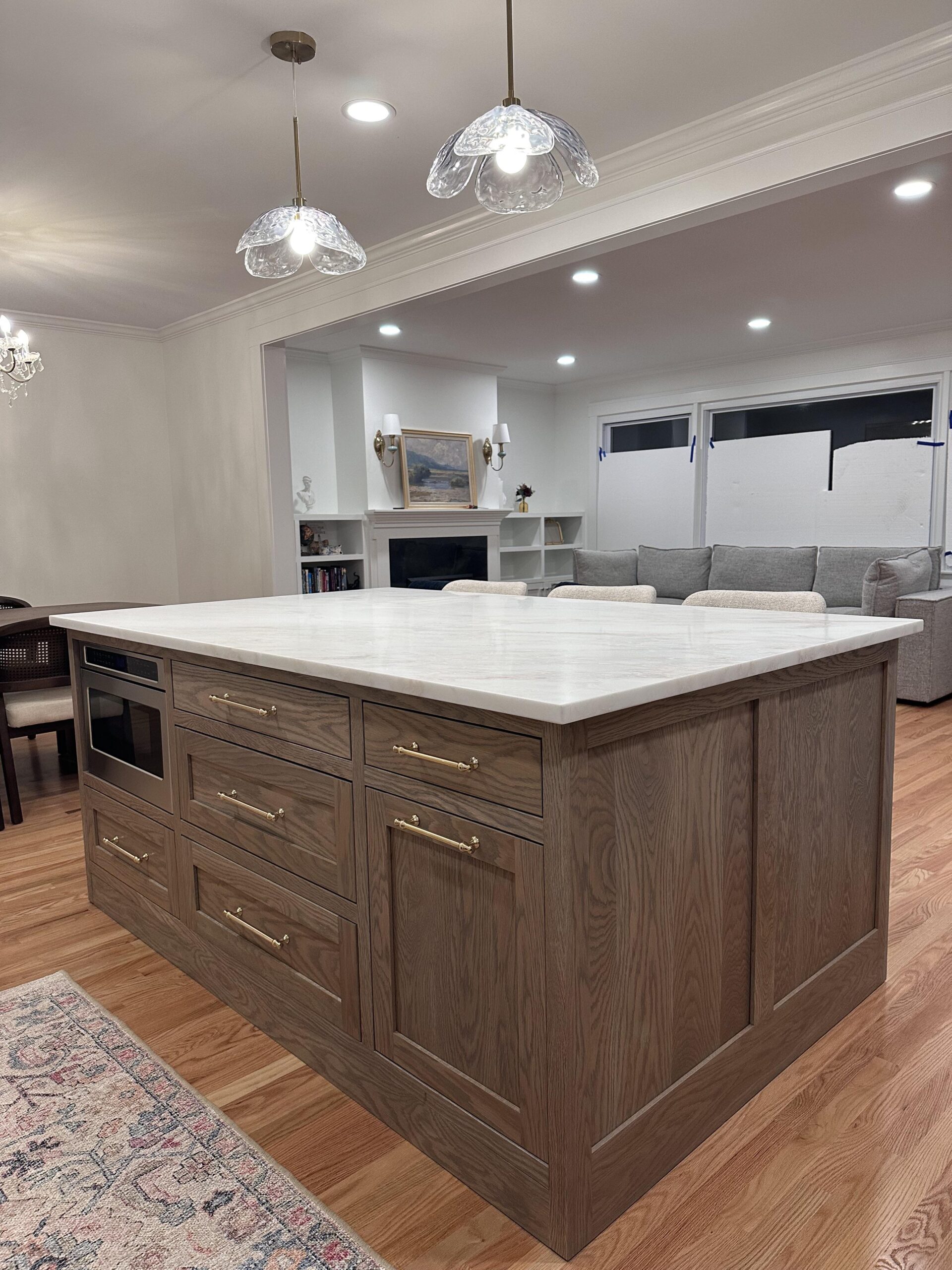
Two scalloped glass pendants hang over the island. Clear glass, shaped like petals, warm brass caps. They throw soft pools of light instead of harsh spots, and they look like something from a boutique lighting shop even if they came off Amazon.
A faded vintage runner in soft reds and blues sits on the hardwood floor. That rug is quietly doing a huge amount of work. Without it, the kitchen would read cold and staged. With it, the room feels lived in and collected over time.
Even the small details land. A tall cabinet on the right has a brass mesh insert instead of glass. That’s the kind of touch nobody doing a basic flip would think of.
The lesson for anyone with a cherry kitchen
If your kitchen looks like her before shot, you’ve been told for a decade that the only way forward is to erase every warm tone in the room. White boxes, white counters, white walls, start over.
She proved the opposite works better. Keep the wood somewhere. Pick a warm neutral instead of a cold one. Spend the money on marble and a real sink. Add brass and a vintage rug. Open the room up if you can.
The all-white kitchen was never the answer. It was just the loudest one.