
Her old kitchen was white, bright, and set up exactly the way people are told to set up a small kitchen. It still felt cramped. What fixed it wasn’t a bigger footprint. It was something most people never even look at.
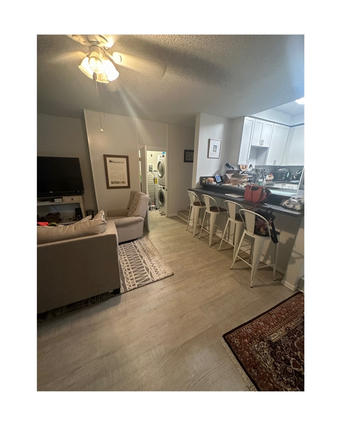
Anna and Colin Bruton’s kitchen in Hawaii looked, on paper, like it should have worked. White cabinets. Gray and black bits mixed in. The safe, bright look that gets pushed in every single “make your small kitchen feel bigger” article on the internet.
In real life, the couple’s own word for it was “ugly.”
“It was cramped, the storage wasn’t good, and honestly, it was just ugly,” they said. They wanted it to feel bigger. They wanted more room to store stuff. They wanted a different feel overall.
So they called in a designer named Shaolin Low. And what she did to the room broke almost every rule the internet swears by for small kitchens.
The couple thought they had a design problem
For most of the time they’d been living with it, Anna and Colin assumed what most of us assume about a kitchen that isn’t working. It looked dated. It looked cheap. It needed prettier finishes. It needed a fresh coat of something. Maybe better lighting. Maybe the cabinets needed to go from white to a warmer white.
That’s how most people talk about their own small kitchens. The complaint sounds like a look problem, so the fix people reach for is a look fix. Paint. New handles. A tile swap. A statement light over the sink.
But when Shaolin walked through the room, she didn’t lead with color. She barely mentioned it at first. The first thing out of her mouth was about the cabinets themselves, and it wasn’t a compliment.
The old kitchen wasn’t actually small
The original cabinets weren’t just dated. They were, in her words, falling apart. They were the basic kind that come standard when a builder is trying to keep costs down. And there’s an honest truth about most builder-standard kitchens that most homeowners never get told: they aren’t built to use every inch. They’re built to be cheap and quick to install.
That’s a real difference. A cheap layout treats the corner cabinets as filler. It treats the sliver of space next to the fridge as a gap you can’t do anything about. It sticks in a drop counter (that awkward lower ledge some kitchens have that nobody actually sits at) because it’s easy to build, not because it’s useful.
Shaolin looked at Anna and Colin’s white kitchen and saw something the couple couldn’t see from inside it: the room wasn’t small. It was full of dead spots pretending to be storage.
Which meant the fix wasn’t about size at all
Once she saw the room that way, the rest of the plan almost writes itself. She wasn’t trying to make the kitchen bigger. She was trying to stop the kitchen from wasting itself.
That changes the whole approach. You don’t need a wall down or an addition for that. You don’t need to knock through to the dining room. You need to walk the room, one cabinet at a time, and be honest about which parts of it are actually earning their keep. In this kitchen, the answer was: not many.
She also didn’t try to solve every dead spot the same way. Each one got its own fix, matched to what that specific corner or gap was doing wrong.
She started by making it darker
The first move was the one most people would flinch at. Instead of leaning harder into the bright, airy look, Shaolin painted the cabinets sage green. Then she added a soft pink tile behind the counters. Then gold-colored faucets. Then pulls and knobs made from old wood and marble.
In a small kitchen. That the couple planned to eventually rent out.
If you go by the standard advice, this is exactly what you’re not supposed to do. Strong cabinet color in a small room is supposed to close it in. A pink backsplash (the tile behind the sink and stove) is supposed to make a tight space feel busy. Mixing gold, wood, and marble in a kitchen that already felt cramped should have been the last straw.
None of it happened. The finished room feels calmer than the white one it replaced. It also holds a lot more stuff, which is the confusing part, because the space didn’t grow by an inch (or a centimeter).
And she refused to touch the footprint
No wall came down. No addition was built onto the outside. Same square footage. Same corners. Same window spots. Same appliances plugged into pretty much the same places.
This wasn’t a case of “it feels bigger because we opened it up.” Nothing was opened up.
The couple even said so after: “The kitchen is still small.” Small kitchen, same shape, strong color, and yet the room now works two or three times harder than the version it replaced. That’s the piece that doesn’t add up on first look.
So where did the “new” space actually come from
Four moves. That’s it. Each one aimed at a specific spot the original kitchen was throwing away.
- The two dead corners got put to work. In one, Shaolin put in a pull-out shelf system that reaches into the deep, hard-to-reach back of an L-shaped cabinet (the part you can never get to without lying on the floor). In the other, a lazy Susan (a round spinning shelf) that turns a useless corner into full storage. She also worked in a pull-out trash can, which freed up the floor space a standing bin used to eat.
- The fridge got slimmer. A thinner fridge sounds like a small change on paper. In a tight kitchen, it gives back a few inches (around 5 to 10 cm) of counter and cabinet run you didn’t know you were losing.
- The drop counter got taken out. That awkward lower ledge that came with the original layout was pulled out completely and replaced with a real pantry, one with rolling shelves so nothing gets lost in the back. This is where the biggest storage jump quietly happened, and it’s the part almost no before-and-after piece talks about.
- Open oak shelves went up where more closed upper cabinets would have felt heavy. They add real storage without making the room feel smaller, and the couple calls them one of their favorite parts of the whole project.
Add those four fixes together and a kitchen with the exact same walls suddenly holds a pantry, a working corner cabinet, another working corner cabinet, a hidden trash pull-out, and open shelf storage that wasn’t there before. That’s where the three-times-the-usable-space line comes from. Nothing magic. Just corners doing their job for the first time.
And this is why the green worked
There’s a twist inside the twist. The sage cabinets and pink tile weren’t a distraction from the storage work. They’re what made all of it disappear.
A room freshly packed with a pantry, working corners, open shelves, and a full backsplash could easily read as crowded. The soft colors give your eye somewhere calm to land instead. That’s the reason the busier kitchen feels less busy. The color is doing the visual work so the storage can do the physical work underneath.
The whole thing took about a month and cost somewhere between $60,000 and $75,000 (around 55,000 to 69,000 euros), which is real money but not full-gut-remodel money.
The lesson isn’t the shade of green. It’s that most small kitchens aren’t actually small. They’re just badly laid out. Before you knock down a wall or paint everything white, it’s worth walking your own kitchen and being honest about the corners, the fridge gap, and any awkward stub of counter you never sit at. There might be a pantry hiding in there.


