
Daniela Sanchez lived with a room that had a strange power over her.
Nothing was technically broken. The cabinets closed. The stove worked. The floor was clean. On paper there was no reason to feel anything at all when she walked in. But something happened every time she did. Her shoulders would drop. Her voice would go quieter. She’d find herself wanting to leave before she’d set her keys down.
She has a specific way of describing it. “Every time you walked into the kitchen, it honestly felt like the energy was being sucked out of you.”
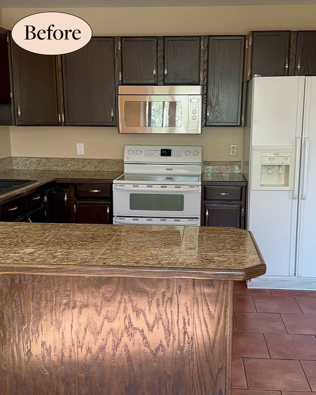
Not ugly. Not falling apart. Draining.
The room had been like that since 1979. It came with the house, and aside from the appliances, nobody had really touched it. In photos it wasn’t hideous, just heavy. Dark cabinets. Yellow-beige walls. A layout that closed the dining room off into its own little cave. And a detail most people miss on first glance: the exact same tile ran across the floor and the countertops, so your eye had nowhere to land. Everything blurred into one continuous brown surface.
Anyone looking at that room would land on the same conclusion. The kitchen was too dark, and it needed more light.
That’s the standard playbook. You’ve seen it a hundred times. Dark kitchen? Add a window. Punch a skylight through the ceiling. Swap in bigger pendants. If a room is sucking energy out of the air, the answer is more brightness. Common sense.
What She Actually Did
So Daniela hired Amanda Hamilton Interior Design to draw up the plan and Griffel’s Custom to build it, part of a full six-month townhouse renovation. The kitchen alone cost around $60,000. And when you look at everything that got done in that room, one thing is missing from the list.
Not one new window was added. Not one skylight. She didn’t enlarge a single opening in an exterior wall.
She didn’t move any of the existing windows, either. She didn’t put in bigger overhead lights. She didn’t swap the light fixtures for something brighter. In a kitchen she’d just described as sucking the energy out of anyone who walked in, she spent $60,000 without doing the one thing every home show would have told her to do first.
What she did instead sounds almost small. She painted the cabinets in a warm off-white called Collingwood. She took the wall down between the kitchen and the dining room. She chose panel-ready appliances, which just means the fridge and dishwasher wear cabinet fronts instead of showing off as big stainless boxes. She tucked the drawer pulls away. And, in the loudest decision she made, she painted the island a soft pink called Rose Silk, on a curved shape the designer suggested.
By any reasonable read of the “before” photos, none of that should have been enough. Warmer paint on the cabinets doesn’t add a single lumen to a room. Taking a wall down opens up sightlines but doesn’t create light out of nothing. Hidden appliance pulls don’t change how much sun comes through a window. And a pink island is a color choice, not a lighting fix.
Yet Daniela describes the finished room this way: “There truly isn’t one thing I would change.” Same footprint. Same windows. Mostly the same walls. Somehow a room that had made her feel drained for years now feels, in her own words, perfect for her family.
If nothing changed about the light coming in, what actually changed?
Because Daniela had figured out something about her kitchen that most people would have missed.
The room wasn’t dark. It was buried.
She’d had south-facing windows the entire time. South-facing windows are the ones designers quietly fight for, because they pull in the most consistent, warmest natural light of any direction, all day long. She already had the best light source a kitchen can have. She’d had it since she moved in.
The dark cabinets had been absorbing that light. The tile-on-tile surfaces had been bouncing nothing back. The closed-off wall had been stopping the light from traveling. All that beautiful south-facing sun had been hitting the space for decades and getting swallowed before it could reach her.
Once you see the problem that way, every one of her decisions clicks into place, and the pink island stops looking like the star of the story. Collingwood, hidden pulls, panel-ready fronts, an open sightline through to the dining room. Every single move was designed to stop absorbing, stop cluttering, stop blocking. The pink is only the reward, the one loud thing you can safely add to a room once you’ve quieted everything else down.
If your own kitchen feels draining, ask the un-burying questions before the lighting ones. Which way do your windows actually face? Where are matching surfaces blurring into each other? How many exposed appliance fronts and mismatched pulls are your eyes taxing themselves on? Are your cabinets painted a cool white that fights the warm sun, or a warm off-white that carries it forward?
Sometimes a room isn’t ugly. It’s just been holding its breath since 1979.


