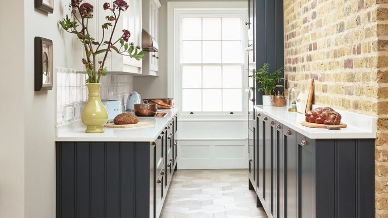
Farmhouse kitchens get written off as a style that already peaked, but the ones people actually hold onto never looked like the Pinterest version in the first place. The farmhouse kitchen ideas below come from homes that still feel like someone cooks in them.
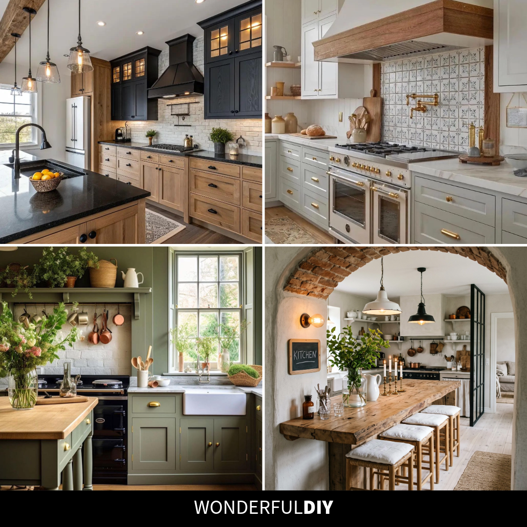
Farmhouse Kitchen Ideas That Still Feel Like Someone Lives There
Farmhouse took a beating the last few years because people kept treating it as a shopping list: barn door, shiplap, mason jars, done. The kitchens that actually age well skip the costume and keep the bones, which is usually some mix of warm wood, honest materials, and a layout built around how a family eats.
These aren’t styled for a catalog. They’re the kind of kitchens where the counters show a little life and the paint color was picked because the owner liked waking up to it, not because it was trending that season.
The Two-Tone Trick That Lightens Black Cabinets
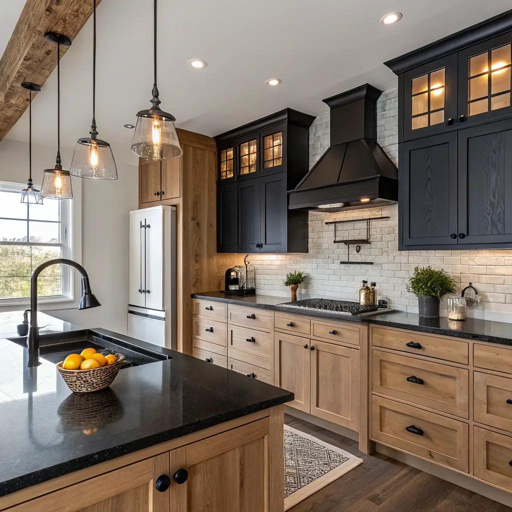
Stacking black uppers on top of oak lowers sounds like it should feel heavy, but the opposite happens here. The wood grain on the bottom warms up the whole room so the black reads as a feature, not a wall of darkness. If you want the look without rebuilding your kitchen, paint only the uppers a deep charcoal or black and leave the lower cabinets in their natural wood finish. The white brick backsplash is what ties it together and keeps the two colors from fighting each other.
Why Wood Trim Softens a White Hood
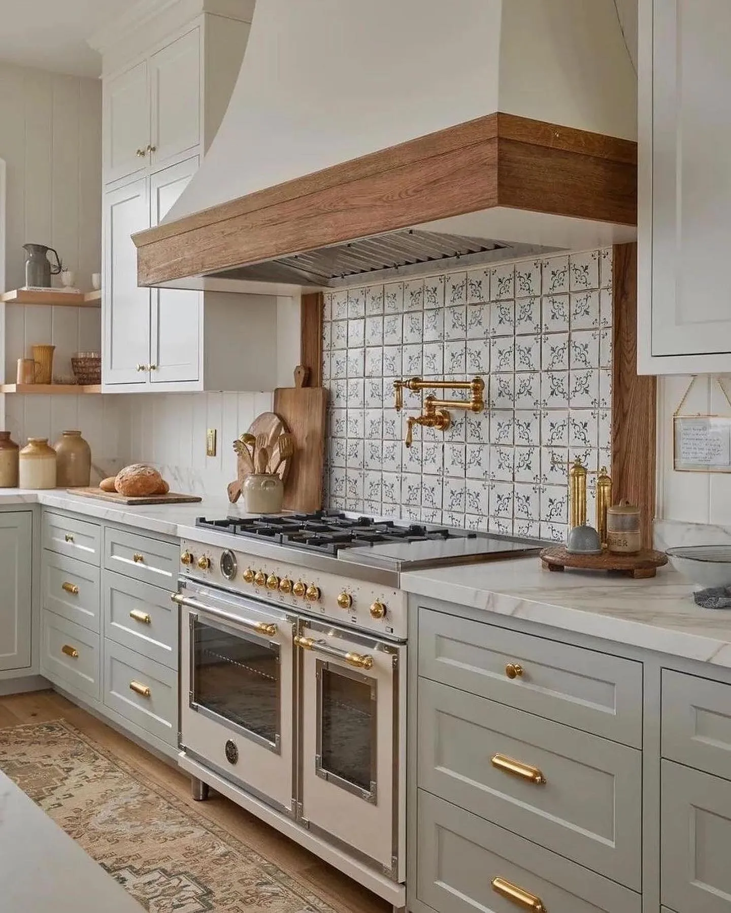
A plaster hood on its own can feel cold, almost like a prop. Wrapping the bottom edge in a thick band of raw wood is what makes this kitchen feel finished. The wood brings down the scale of the hood and picks up the warm tones in the floor so the eye has something to travel between. The patterned tile behind the range gives the whole wall a focal point without a painting or art. If you want a similar move in a plainer kitchen, there are other backsplash ideas worth copying besides plain white subway that pull the same weight.
The Sage Green That Behaves Like a Neutral
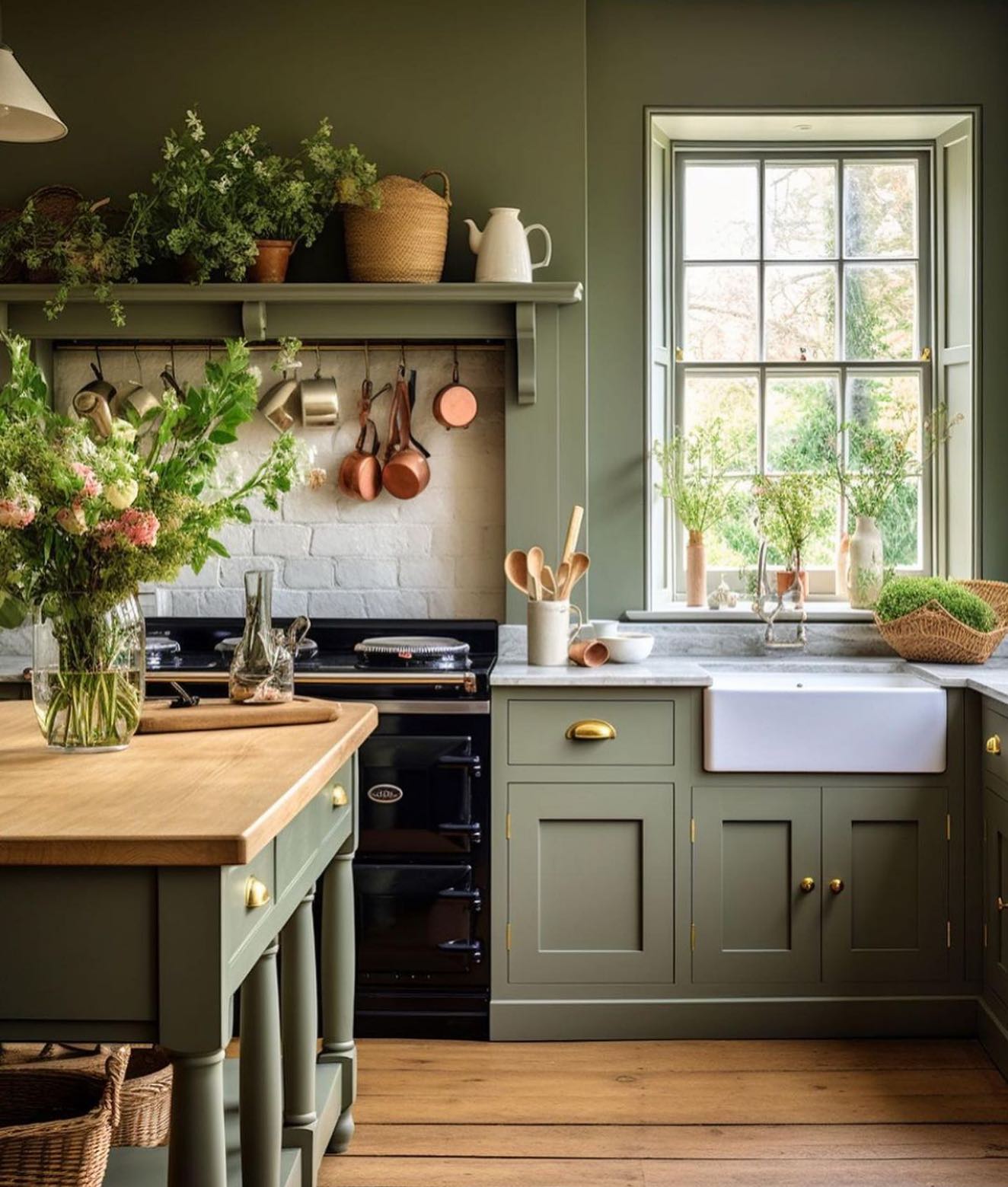
Sage is one of the only greens that behaves itself in a kitchen because it sits between gray and olive, so it reads as a neutral once you live with it. Here it works with the black Aga, the brass hardware, the copper pots, and the wood floor without any of those feeling added on later. The shelf above the stove running almost to the ceiling is the smart part: baskets and plants up top, pots hanging below, and nothing stored where you can’t reach it from the counter. Sage kitchens that never go overboard on color are worth a scroll if this one spoke to you.
How a Brick Arch Reshapes a Room
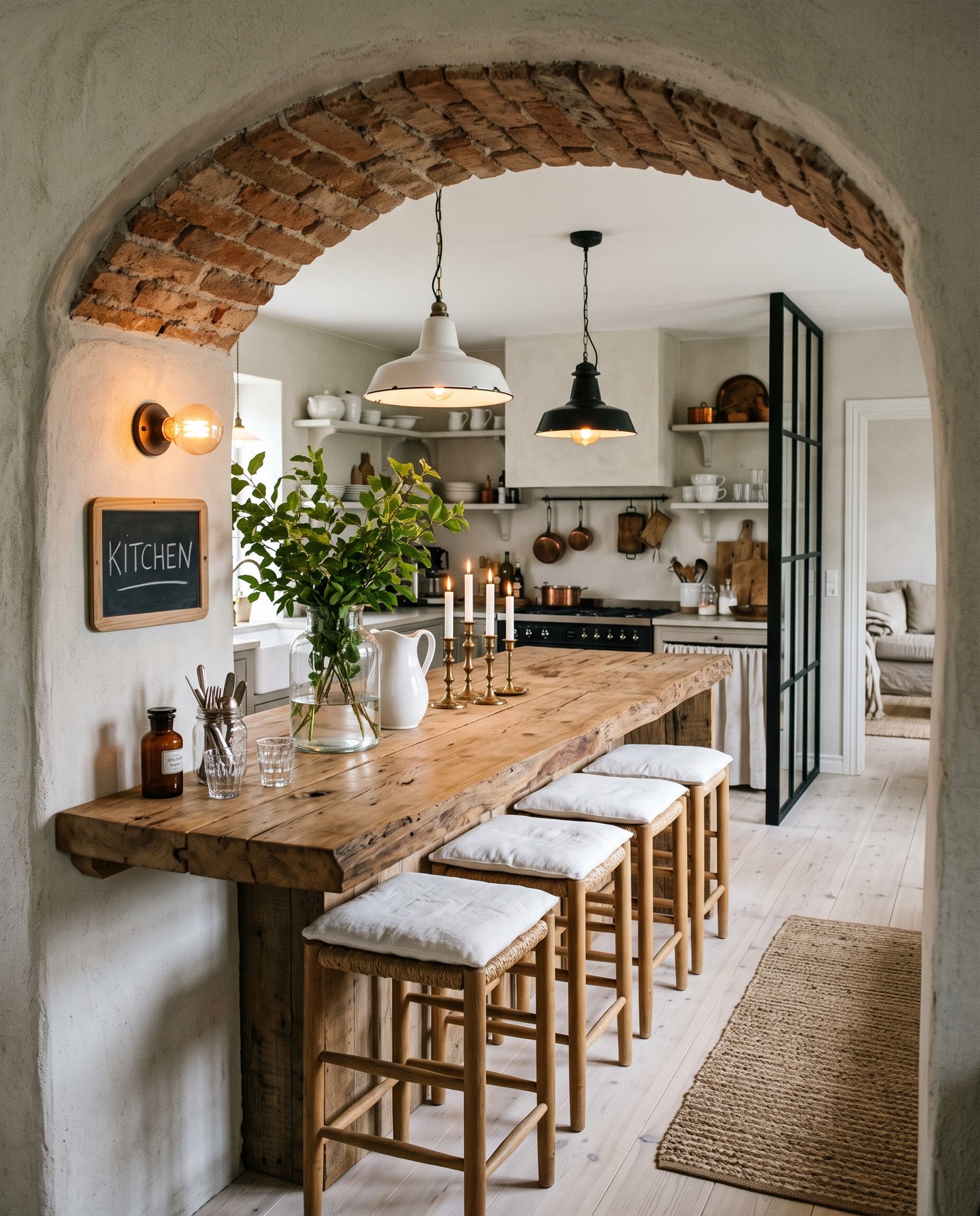
The arch is doing more work than it looks like. Dropping a thick, slightly imperfect arch between two rooms makes the kitchen feel like a separate space you walk into, not just the back half of the floor plan. The reclaimed wood slab counter underneath is the second half of the trick: it’s deep enough for four stools and has the kind of rough edge that makes the new kitchen behind it feel older than it is. Candlesticks and a pitcher of greenery on top, and you’re done decorating.
The Mix That Reads Expensive, Not Fussy
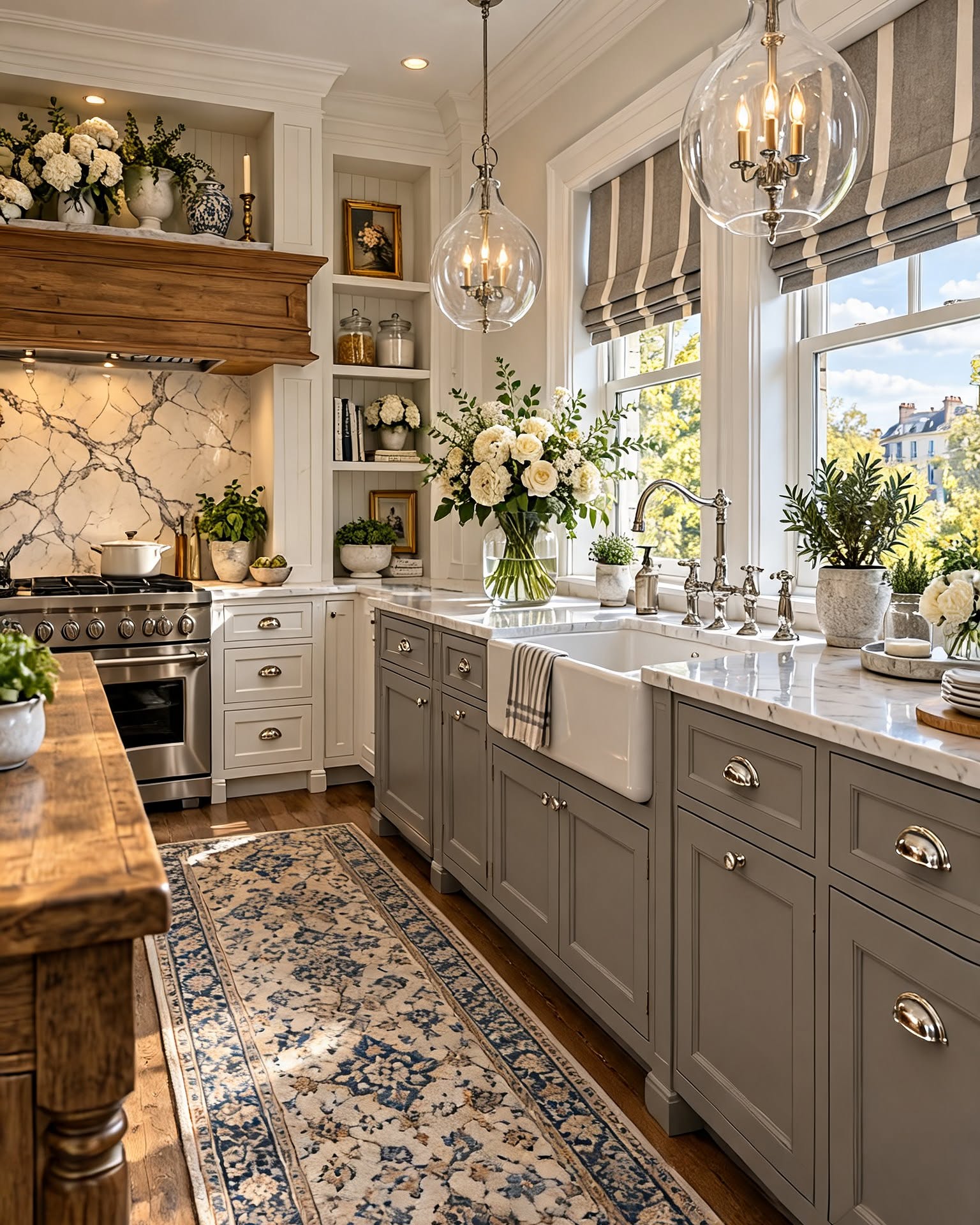
Light gray lower cabinets, cream uppers, marble behind the range, and polished nickel hardware. The reason this reads as high-end instead of fussy is that no single piece is trying to be the main event. The marble is busy, so the cabinets stay quiet. The hardware is reflective, so the matte paint has something to bounce off. The striped roman shades at the window are the one pattern in the room, which is why they land instead of competing. If you’re copying one thing, start with the hardware swap, because it changes the feel of a kitchen faster than a paint job.
Stone and Copper Age Better Than Paint
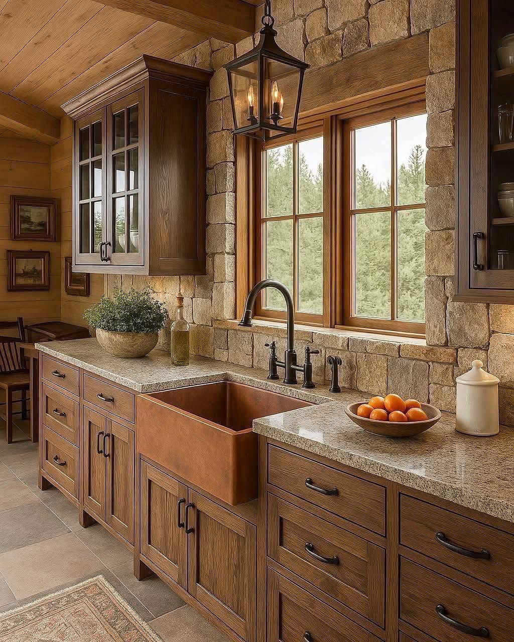
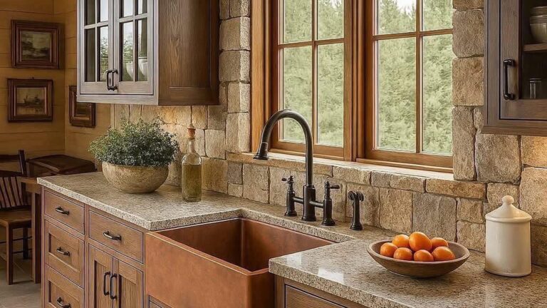
Framing a window in stacked stone pulls your eye outside before you notice anything else in the room, which is the whole point in a kitchen with a view like this. The copper sink in front of it is one of those finishes that gets better with age: it darkens, picks up fingerprints, and ends up looking like it was always there. Pair that with warm wood cabinets and iron hardware and the kitchen reads as cabin-built, not country-themed. Good move for anyone with a woodsy view they want the kitchen to actually use.
The Island Detail Carrying the Whole Room
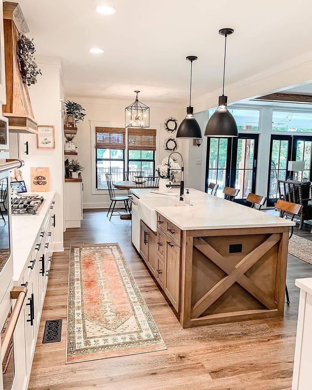
The rest of this kitchen is standard modern farmhouse: white cabinets, black hardware, wood floor, white counters. What saves it from being every open-concept build from the last ten years is the island. The X detail on the end panel is a cheap woodwork trick that gives a flat surface something to look at, and the natural stain keeps it from reading as too matchy with the rest of the wood tones. The two oversized black pendants on long drops do the same thing from above. Little moves, big difference.
Which of these farmhouse kitchens would you actually want to cook in?